Students will be able to list and define the 7 Elements of Art.
Students will be able to use each of the elements appropriately to create engaging compositions.
Mini-Assignment
Research good typography. Examples can be found here and here. Which works are you drawn to? Why? Why do you think some of the designs are more successful than others? What makes bad design?
Gesture out 5 of your favorite typographical works in your sketchbook. Take notes about why you chose those 5 and also answer the questions above.
Research the Elements and Principles of Art and Composition using the links to the right, under “Research”. Take notes in your sketchbook.
Materials
Pencil
Bristol or Illustration Board
Ruler
Ultra Fine Tip Sharpie Marker or Micron
Process
Using a sheet of Bristol board, create 4, 4 inch by 4 inch boxes, arranged in a grid. Draw these with your black sharpie and make sure that you use a ruler. You will end up with 2 sheets of paper, each with 4, 4 by 4 inch boxes. 8 boxes total.
Find a source of inspiration. You will need to use something like a work of poetry (example), ideas (example), politician’s most used words (example), Your inspiration can be anything but must be related. The words you choose should idealized your source of inspiration.
Choose 8 words from your inspiration and illustrate each of these in one of the boxes. For example, if you choose the word “winning”, figure out a creative way to illustrate the word winning that illustrates that idea. If you choose the word “sonder”, how can you illustrate the word while also illustrating the idea.
Use the sharpie marker to illustrate these ideas. Your drawings may not go outside of the box.
Think about the design elements and principles. Are you creating too much contrast, not enough? Is it so harmonious that the work is boring (is that ok?)? Is it balanced? Should it be?
Hint – Do not try to draw tiny illustrations. You are NOT trying to illustrate the definition. You are trying to illustrate the word.
1. Demonstrate an understanding of the visual element line and texture and the visual principle pattern / movement. 2. Demonstrate an exploration of graphite and appropriate use of graphite. 3. Demonstrate an understanding of detail and craftsmanship
Mini-Assignment
1. Find one black and white landscape photograph and bring it in (magazines, books, internet). Describe the landscape in no less than 30 sentences. At least 5 of these sentences must be emotional descriptions. Make sure that you describe everything from number of trees to their location to their texture. Describe both the physical properties of the landscape and the emotional qualities. How does this landscape make you feel? 2. Watch at least two videos from Button Poetry
Major-Assignment
1 drawing on 18″ by 24″ white paper or larger
Materials
White drawing paper Pencil Kneaded eraser Chamois
Info
Making artwork is taking an idea and trying to communicate that idea to the world. We do this through language. The goal of this assignment is to force you to think about how we communicate. Artwork that is rather boring in nature is like a bad dating site profile. It is bland and doesn’t really tell us anything about that person. Great artwork lets us in on all the peculiarities of that object. The bad, the good, the ugly. Great art is like great poetry; it doesn’t just capture the image, it makes us feel it.
Process
1. Bring in the description you created and the photograph you used for your mini assignment. 2. Trade your description (but NOT the photo) with a partner. Do not allow them to see the photo. 3. Draw each other’s descriptions.
To understand and apply the principle of unity as it relates to two-dimensional art.
To introduce a range of principles and methods for unifying diverse elements on the picture plane.
Mini-Assignments
1. Watch and take notes on the video linked below. 2. Define the vocabulary words below in your sketchbook
Materials
“Found objects,” copying machine or camera and printer, card stock, glue stick, x-acto knife.
Time
6 hours
Vocabulary
mark, gesture, point, line, plane, volume, space, dynamic, calligraphy, representational, non-objective, actual lines, implied lines, psychic lines, shape, form.
Info
The ability to make order from chaos is one of the special talents of the artist and the designer. Good design is often a matter of perceiving potential patterns within fields of apparent disorder or visual complexity. There are some basic grouping or unity principles that can be applied to almost any kind of visual information.
Imagine dumping all of your possessions from your wallet or purse on a table top to create a random or chance “composition“. How could you begin to make sense of the chaos? As we saw in one of the first assignments, a frame helps to focus attention by placing a selection of objects within clear borders or boundaries. Imagine the tabletop as your “frame”, and your possessions as art elements ripe for some organizational or compositional treatment. The frame is the first step in creating your composition – it provides “edges” to the field of chaos.
Now, what are some organizational principles we could use for the objects themselves? One of the most basic is the idea of proximity – that is, the clustering of objects. Imagine pushing all of the objects into one corner of the tabletop. Can you see how our attention follows? What if all of the objects are now clustered in the virtual center of the table except one? Our attention naturally shifts to the center of the table – then back to the isolated element. “Proximity” can be played off relative “distance” – in other words, clusters of objects can be balanced against objects that are excluded from the group.
Consider some other strategies. What if the objects were lined up, one after another, in a continuous “implied line?” Designers call this continuation or contiguity. We can use invisible pathways or other patterns (such as grids or controlling lines) to create an implied relationship between the objects.
Another solution would be to simply turn each object so that it faced the same direction -as if everything on the table were magnetized. The result of this treatment is called unified direction. Objects can be grouped according to a whole array of other factors including shape, size, color, texture, etc. Imagine segregating all of the light colored objects from the dark colored objects for example. Or lining up all of the shiny, metallic objects one after another.
Less obvious in its application is the concept of Gestalt. Gestalt theory suggests that we perceive visual events as “wholes” – overall visual patterns – which are grasped all at once. An example would be seeing a “face” in the craters and patterns of the moon. The visual pattern of the human face is a powerful construct that emerges from the otherwise random distribution of dark and light shapes on the lunar surface.
Process
1. Make a collection (minimum of 15) of smallish objects (1″ – 12″) that possess an interesting range of silhouettes and textures. (Flat or nearly flat objects will work best for this project.)
2. Using a copying machine, copy groupings of objects placed upon the glass of the machine to illustrate particular aspects of UNITY in composition as discussed in class and in the video / readings. You may also use a cell phone or digital camera to photograph your objects and print them out, just make sure to do so against a flat background. The copies or prints should be done before coming to class.
We will do the next portion in class.
3. Produce at least five compositions illustrating the concepts of “Chance,” “Proximity”, “Unified Direction,” “Continuation,” “Unity with Variety.”
4. After making several compositions for each problem, cut four strips of white paper and arrange them around each copy, moving them in and out until you feel that the area left showing is a good composition. Cut the copy out in this configuration and mount the best solution to each problem separately on card stock. (You might consider using black or gray construction paper as a backing to produce a darker border.)
Challenge: You might also try to produce an “implied shape” or experiment with filling in the objects with ink or gouache to produce all black and white compositions. Try reversing the black and white relationship to create a “figure-ground reversal.”
Students will be able to demonstrate a basic understanding of composition.
Sketchbook
Watch both videos linked below and take notes in your sketchbook.
Writing
Find an example of good design online and print the image out. Describe why you think it is good design. How are the elements and principles used? Also find an example of bad design and print that image out. Describe why you think it is bad design.
Materials
Smartphone or digital camera
Info
“To quote out of context is the essence of the photographer’s craft. His central problem is a simple one: what shall he include, what shall he reject? The line of decision between in and out is the picture’s edge. While the draughtsman starts with the middle of the street, the photographer starts with the frame. The photograph’s edge defines content. It isolates unexpected juxtapositions. By surrounding two facts, it creates a relationship. The edge of the photograph dissects familiar forms, and shows the unfamiliar fragment. It creates the shapes that surround objects. The photographer edits the meanings and patterns of the world through an imaginary frame. This frame is the beginning of this picture’s geometry. It is to the photograph as the cushion is to the billiard table.” –from The Photographer’s Eye by John Szarkowski, former director of the photography division of the Museum of Modern Art in New York
Process
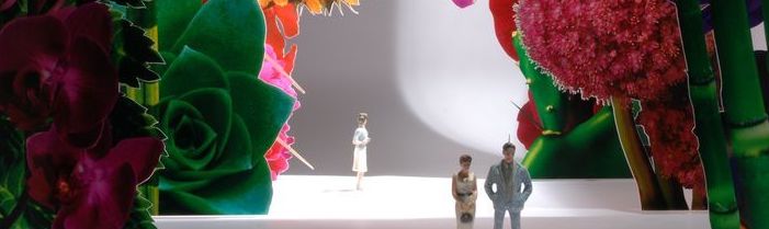
Using your phone or a digital camera, photograph objects or groups of objects that create interesting compositions. A composition is an arrangement of the elements (line, shape, form, value…) combined with the principles (movement, contrast, balance…) to create engaging works of art.
Switch your camera to a black and white filter. Consider what could be “framed” by your camera within your chosen scene or objects. Create 5 different compositions from the same group of objects.
The goal is to think about composition so that you create an interesting image. Would the object be more interesting if you zoomed in or out, cropped out part of the object, arranged the object so that it creates a diagonal across the frame of the camera. Perhaps you could play with lighting or shadows?
This should take fifteen minutes. When you are done, upload your photos here.
As a group we will discuss what views in the room could be beautiful, interesting, well-composed, or explored further.
Students will be able to utilize a grid to aid with drawing at scale.
Students will be able to demonstrate an understanding of size, scale and proportion.
Students will be able to demonstrate a basic understanding of Surrealism.
Materials
1 sheet of 9″ by 12″ Bristol Board
Ruler
Photograph, printed image or magazine image
Drawing materials – either graphite or colored pencils
Old school glue stick (not hot glue)
Sketchbook
Watch videos that are linked below.
Take notes on vocabulary words and research links (at the bottom) in your sketchbook.
Complete Steps 1-3 in the Project section then –
Brainstorm! If you made the object in your image larger, how would it change the context? What about smaller? If the object in your image was next to an ocean, riding a giant french fry or standing tall above everyone else, how would our interpretation of that image change? Feel free to pull other source material into your sketchbook. Do several quick, rough sketches to work out ideas. These don’t need to be perfect – you’re just trying to sort the meh ideas from the wow ideas. Sketches can include photos, drawings, digital work.
Project
Overview – You will be collaging an object from a photo onto a sheet of paper and then drawing on the rest of the paper to change the scale or proportions of the original object.
This assignment is an exercise in understanding how proportion and scale can be used to inform our understanding of a work of art. Large works, particularly sculpture, can intimidate or inspire while smaller drawings may imply intimacy. I encourage you to get creative and not to be afraid of humor.
Check out the examples below under research and then come back. Cool? Cool.
Before you go looking for an image (Step 3) decide first if you want to work in color or black and white. If you have never used colored pencils before, stick with black and white and graphite. We will cover colored pencils and color theory extensively in the next assignment.
Find an image of a real object, person, place or thing. No images of fictional things or illustrated works. You can use something that you found online, a magazine or your own photo. Print out your image or tear it out of a magazine. If you’re working with graphite make sure to print the image in black and white. Colored pencils? Print it in color. The photographic image should account for no more than 20% of your final work. The rest will be drawing.
Sketchbook time! Look at number 3 in the sketchbook section above. Once you are done come back here.
Once you have some good ideas, cut your image as close to the object as possible. Use an exacto knife if you have one but scissors can work if you take your time. Determine where on your sheet of paper your object needs to go and using the glue stick, apply glue to the back of the image. Press it down onto your sheet of paper and make sure to get it nice and smooth. A credit card or ID wrapped in a shirt can help get it flat.
Now start drawing. Think about how you will move from the photograph to the section that you’re drawing. How will you make it look like one cohesive piece?
You will need to fill the entire sheet of paper so get creative.
Vocabulary
Words to know – system, grid, size, relative, scale, anamorphic distortion, ratio, proportion, Surrealism.
A “system” is simply an orderly way of doing something. Art that seems to result from the application of a specific procedure, from repeated use of a pattern or set of patterns, or from adherence to a body of rules is sometimes referred to as “systemic art” or “systems” art.
A “grid” is understood, in most instances, as a system of fixed horizontal and vertical divisions. Grids are among the most adaptable and universally applicable of all systems. Any flat shape, no matter how irregular, can be conceived of in terms of what mathematicians would call X (horizontal) and Y (vertical) axes. The regularity of a grid can be used as an aid in copying, in scale or proportional changes, or to reveal complicated relationships within a work of art.
“Proportion” is a relationship or ratio between parts of a given whole. “Size” is a quantitative description of an object that only makes sense in relationship to either another object or an agreed upon standard of measurement. (e.g., something is “big” only in relationship to something already agreed to be “small.”) “Scale” is a proportional relationship between two sets of dimensions. In general, “scale” refers to the mathematical relationship between an object and a measurable quantity. We say that an object is “full-scale” when it corresponds 1:1 with real life. If the same object is rendered such that any part of it is one-half the length of the original object, we understand this to be at “half scale” or 1:2. One quarter the length would be “quarter scale”, 1:4, or 1/4th scale.
1. Students will be able to demonstrate accurate color mixing and knowledge of color theory.
Mini-Assignments
1. Bring in 3 8×10 color photos and all materials. 2. Watch videos on Color theory linked to the right and take notes in your sketchbook. 3. Create a color wheel and label primary, secondary and tertiary colors. Also label an analogous, complementary and split complementary color scheme.
Materials
3 8×10 Color Photos Acrylic paint Paint brushes (good quality acrylic brushes in an assortment of filberts, flats and rounds) Container for water Small plastic lid for mixing paint
Info
Color is probably one of the most difficult elements of art to use appropriately. Color theory is the understanding of how different colors work together or oppose each other and how different color combinations can affect a work of art.
Major Assignment
Using the color photo as a guide, accurately draw the image on a sheet of Bristol Illustration board (or canvas if you so choose). Once you have the image drawn on your sheet of illustration board, work to accurately reproduce the colors in your image. Try to match the colors as accurately as possible. If you want, you can print out two copies of your photo and use one to paint on to test for color accuracy.
It is easier to paint the light areas first and then back paint the darker sections. Dark can cover light easier then trying to paint a light color over dark paint. Make sure to mix enough color to cover the entire section you are about to paint.
Learning Objectives: Students will be able to create engaging compositions that work not only visually but also conceptually. Students will demonstrate knowledge of the history of propaganda posters, their use and their creation.
Mini Assignment: Take Notes in Sketchbook Gather all needed materials and work on compositions
1. Develop at least 3 ideas with 5 – 10 compositions each. Research your point of view and take notes in your sketchbook.
2. Research propaganda and propaganda posters and take notes in your sketchbook.
Process: For this assignment you will be making 1 propaganda poster using colored pencil. I want to see your ideas, your beliefs. I will be grading you based on how well the idea is presented, not the idea itself. Your personal beliefs will have no bearing on your grade so please be open and honest. Stay away from popular ideas (abortion, gay marriage, gun rights) unless you have some powerful imagery and an incredible idea.
I firmly believe that making the work is the easy part; coming up with a good idea is a sign of true creativity. Spend time developing your idea and the imagery you are going to use to illustrate your ideas.
You will use one 9 by 12 sheet of Bristol board for your poster. Sketch out your poster on a 9 by 12 sheet of paper. Once you are done and I have approved your drawing, use the graphite transfer technique to get your drawing onto your Bristol board.
Students will explore the process of product design from formulating ideas to two-dimension drawings of both the finished product and packaging. Students will be able to demonstrate what they have learned thus far concerning the elements and principals of design.
Materials
Paper Sketchbook Pencil Colored Pencils Marker
Time
See Calendar
Homework
Work out ideas in sketchbook Work with other team members outside of class to complete project Research ideas and processes using the links below
Process
Students should come prepared to class having read both the sections on Time Management and Brainstorming. Students will be broken into groups. As a group, students will decide on a product that they want to either redesign or recreate entirely. You are encouraged to think outside of the box, however don’t try to reinvent the paperclip.
Look around you and think about the things you use everyday. How could you make your coffee cup better, mouse, shows, door handle, computer cables, baby toys, bath products, car keys, better? You may create a piece that simply makes something better or you may combine several functions into one device. The only thing you cannot try to design are electronics or electronic interfaces (think iPhone)
Once you have your object decided, start thinking about color, materials and packaging. Does the item need to be made from plastic, steel, concrete, or wood? Will your packaging focus on eco-conscious ideas or go with the mentality that “bigger is better”?
Make sure to communicate with your group. You will be earning two grades for this project; one for you individually and one as a group. There are no excuses for sitting on the sidelines.
There are several components that will be presented as the finished work. These include:
Preliminary Sketches and Ideas Rough Sketch Final Product Design presented on 1 large sheet of 18” by 24” paper, in color Final Package Design presented on 1 large sheet of 18” by 24” paper, in color
Students will be able to create engaging compositions that work not only visually but also conceptually. Students will be able to demonstrate basic relief printmaking techniques. Students will demonstrate familiarity with basic printmaking terms. Students will demonstrate knowledge of the history of propaganda posters, their use and their creation.
Take Notes in Sketchbook Gather all needed materials and work on compositions
Process
For this assignment you will be making an edition of 5 prints that deal with the idea of propaganda. I want to see your ideas, your beliefs in print. I will be grading you based on how well the idea is presented, not the idea itself. Your personal beliefs will have no bearing on your grade so please be open and honest. Stay away from popular ideas (abortion, gay marriage, gun rights) unless you have some powerful imagery and an incredible idea.
I firmly believe that making the work is the easy part; coming up with a good idea is a sign of true creativity. Spend time developing your idea and the imagery you are going to use to illustrate your ideas.
You will use one block of 8″ by 10″ linoleum for your prints. Sketch out your poster on an 8” by 10” sheet of paper. Once you are done and I have approved your drawing, use the graphite transfer technique to get your drawing onto the linoleum block.
Using the techniques discussed in class, start carving your block. Remember, in a relief print, that what is carved away will not print. Whatever is left, or not carved away, will print. You must use at least 3 colors in your print. Always work from light to dark. You can use hatching techniques to get changes in value and gradations. Look closely at a dollar bill. All of the shading is created through one color. Shading is created through hatching and cross-hatching.
Using techniques discuss in class, use masking tape to create a registration grid. This will be used so that all of your prints print in exactly the same spot every time.
Once you have your block completely cut out and the little bits of trash carefully removed it’s time to print. I like to have two tables set up as I am printing, one for inking the block and a clean table for printing. Using a piece of tile, spread a layer of ink across the top. Using the brayer, grab some of the ink and pull it down. It should sound like sizzling bacon and should have an even texture of tiny little peaks. If you have streaks, you have too much ink. If the roller is not turning, you have too much ink. Use the brayer to “transfer” ink to the block. Cover the entire block with ink. The first coat will usually be absorbed by the block and therefore your first print may be light. You want a consistent spread of ink across your block. Make sure it’s smooth with no bits of trash or fingerprints. Work fast when inking the block and printing.
Once you have inked your block, place it in the middle registration grid, lay a sheet a paper on top, making sure to line it up with your masking tape and print your image. You will be creating an edition of 5 prints, however you can create more to trade with classmates. An edition of 5 prints means an edition of 5 of your best; no fingerprints, smudges, etc.
Students will be able to accurately capture objects using contour drawings.
Students will be able to differentiate between positive and negative space.
Students will be able to create engaging compositions through the arrangement of shapes and lines.
Students will demonstrate an understanding of correct color mixing, basic knowledge of color theory, and correct painting techniques.
Materials
2 sheets of 9″ by 12″ Bristol Board
Set of Acrylic Paints (Need at least Red, Yellow, Blue and White)
Small Acrylic Paint Brushes
Copy Paper or other loose paper
Pencil and pen
Tracing Paper
Sketchbook
In your sketchbook or on a piece of Bristol board, create 3, 7 step monochromatic color scales. Monochromatic means one color, so you will choose one color and gradually make it lighter until you reach white. Example
Using the Adobe Color website, create at least 8 different color schemes. Choose 3 of these to recreate in paint on Bristol board. Label them according to which color scheme they belong too. Try to avoid analogous color schemes. Reference
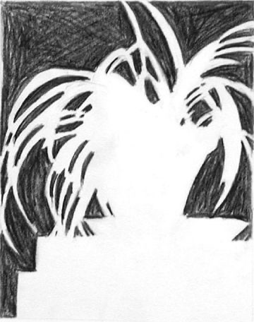
Must be done before coming to class – 10 Contour / Negative Space Drawings of architecture and / or plants. The examples below are Contour or Negative space drawings. You are combining this idea. You’re drawing the negative space as an outline but don’t need to fill it in.
On a piece of Bristol board, draw a sphere and a box. Try to use a real ball or box as a model so that you can see what happens when light hits the object. Choose a different color for each and paint them so that they appear three dimensional. Examples are below.
Examples of Painting a Cube and Sphere
Examples of Contour / Negative Space Drawings:
Project
Overview:
Preparing the Compositions:
For this assignment you will need to complete 10 contour / negative space drawings of architecture (power lines, gaps between buildings, stop light wires) or other linear objects (vines, plants, trees). These are simple line drawings so don’t spend more than 10 minutes or so on each of them. You can include the buildings themselves or if you’re doing power lines, the poles, stop lights, transformers, etc. You will need to create these contour drawings on standard 8.5 x 11 loose copy paper – not your sketchbook. Try to capture as many details as possible and remember that you are drawing the negative space, the air around the object, not the actual building or plant itself. Focus on the positive (the object itself) and the negative (the sky or air) to create your drawings. Try parking in a business parking lot that faces an intersection or visit a garden center. You can sit in your car, turn the music up, and get some really interesting drawings
Once you have your 10 different drawings, start looking for interesting combinations by overlapping them. If you can’t see through the paper, you can tape your drawings to a window backlit by the sun to help. You might overlap a drawing of vines with a drawing of powerlines to create a nice contrast between organic and geometric shapes. You may use certain elements more than once if that works for your composition.
Take a sheet of tracing paper and draw a 5″ by 8″ rectangle. Lay the sheet of tracing paper over the collection of drawings and move it around until the best part of your composition fits your rectangle. Slowly trace the lines onto the tracing paper. You don’t need to include everything – these drawings are meant to help you create a composition, not force you into one. Push your lines all the way to the edge of your 5″ by 8″ rectangle. Let me see these compositions before you go on to the next step.
Use a 2B or higher (3B, 4B, 6B…) to completely cover the back of your tracing paper. Once you are done, lay a sheet of bristol board underneath, making sure that your rectangle is centered, and, using a ball point pen, slowly trace your lines. Be careful not to let the paper move and don’t push down to hard. Once you are done the tracing paper drawing should have transferred to the bristol board
Painting:
Once you have your 3 different compositions created, you will be painting them with acrylic paint. You will need to work out color compositions in your sketchbook before you start painting. Think analogous, complement, split complement, triadic, etc. Once you have your colors worked out you will paint your compositions with the utmost attention to detail. No white should be seen and the paint should be applied as evenly and as flat as possible. Start with your lightest colors first because it will be easier to paint over mistakes with darker colors.
A few tips – Take your time. Practice. Acrylic can be fussy because it dries really fast. You want your final paintings to almost feel like they are digital or were printed. This is not how artists typically use acrylic but it will help you better understand how to control it.