In preparing for a critique in this or any studio art class, it is at least as important to determine what you want or need from the critique, as it is to understand what is expected of you. Your critique should address form and content, and should consider the work of art in and of itself, and in the context of issues discussed in the reading assignments. Terry Barrett, in his book Criticizing Photographs, defines criticism as “…informed discourse about art to increase understanding and appreciation…” As such, criticism involves much more than the relatively simple act of judging–of determining whether one “likes” or “dislikes” a piece. Rather, it is a means toward the end of understanding a work of art. Critical consideration usually consists of at least three main activities:
Describing the work (what does it look like? what is it made of?): Assume the audience has not and will not view the piece and that you are the sole mediator for their understanding of it’s formal qualities.
Interpreting the work (what does it mean?): Here you are asked to synthesize any contextual or biographical information you have with your own subjective interpretation of the work’s significance.
Evaluating the work (is it art? is it interesting? does it “work”?): This is, perhaps, the most difficult critical task, yet it is usually the one to which most people skip when criticizing a work of art. To thoughtfully evaluate a work of art, you must determine what your criteria are for judging its relative worth or effectiveness. Only you can provide this information. Do not assume the reader (or your fellow student) shares your point of view. Explain why you feel the way you do. “Thumbs up” or “thumbs down” will not cut it. This is college.
Here are some simple guidelines for a successful critique:
Listen! Most people new to the critique forum fail to understand that criticism of a work does not mean the work is “bad”, or that the artist has failed in some way. In order to refine our ability to produce effective artworks, we must listen to what the participants in the critique have to say about it. This is not to discourage robust debate, by any means. Some of the most lucid insights arise out of heated arguments about a work of art. Rather, it is imperative that each point of view be expressed so as to maximize the benefit of this most unusual form of public discourse. The whole point of the exercise is to go make better work.Describe the image: What do you know with certainty about what you see? What do you see? What adjectives come to mind? What is the subject matter, really? What about form? How does the relationship between light and dark, contrast and tone affect your description? How does the technical treatment of the print affect your reading of it? Can you compare/contrast this image with another in the group?Interpret the image: What does this image mean? How is this meaning manifested? Can you discern a difference between what was intended and the result? Are there metaphors you can decipher? Although thedenotative meaning may seem clear (a photograph of a still-life set that includes a roll of toilet paper, a plastic garbage bag, and a wad of aluminum foil can be said to denote (show) a roll of toilet paper, a plastic garbage bag, and a wad of aluminum foil), what is the connotative meaning? The same photograph could, for example, connote (suggest, imply) fragility, entropy, waste, excess, or any number of completely different ideas. Do the objects depicted in the image have a connotation that owes its context to the nature of the materials they resemble, or is the connotation based in something else like light, shadow, form, composition, color, etc.? Further, from what perspective do you bring your interpretation to this work? Comparative? Archetypal? Feminist? Psychoanalytic? Formalist? Semiotic? Biographical? Intentionalist? Technical? No work of art nor artist ever existed in a vacuum. Can you identify a combination of approaches or cultural influences in your interpretation? Can you categorize this photograph according to Terry Barrett’s system? Is it Descriptive, Explanatory, Interpretive, Ethically Evaluative, Aesthetically Evaluative, Theoretical, or some combination thereof? Explain your criteria for determining the appropriate category.What is this image’s internal context (that which is descriptively evident)? What is its original context (what was physically, psychologically, and/or politically relevant to the artist at the time of the creation of the work? What is its external context (the situation in which the work is seen or presented)? How does the latter inform the former?
Is this a successful work of art? Why/why not? What criteria have you used to make your judgement? Be very specific.
Whereas it is mandatory that you respect your colleagues in the class (I don’t tolerate abusive behavior at all), we are here to get work done. Please check your ego at the door. I need you to be willing to say what you think about others’ work and to hear potentially harsh criticism about the work you’ve done. In order to become better artists, we must be willing to speak openly about the issues at hand and to dispense with qualifying opening remarks such as “this is just my opinion” and the like.
The most important thing to remember is that, although we may each be in this class for different reasons, we are all (presumably) striving to make more and better works of art. The old adage “…I don’t know about Art, but I know what I like..” is no longer applicable to your mode of inquiry. Yours is to be a rigorous and rich process of taking your work apart and putting it back together–better than before–with the help of this lively critical forum. (From SUNY Albany)
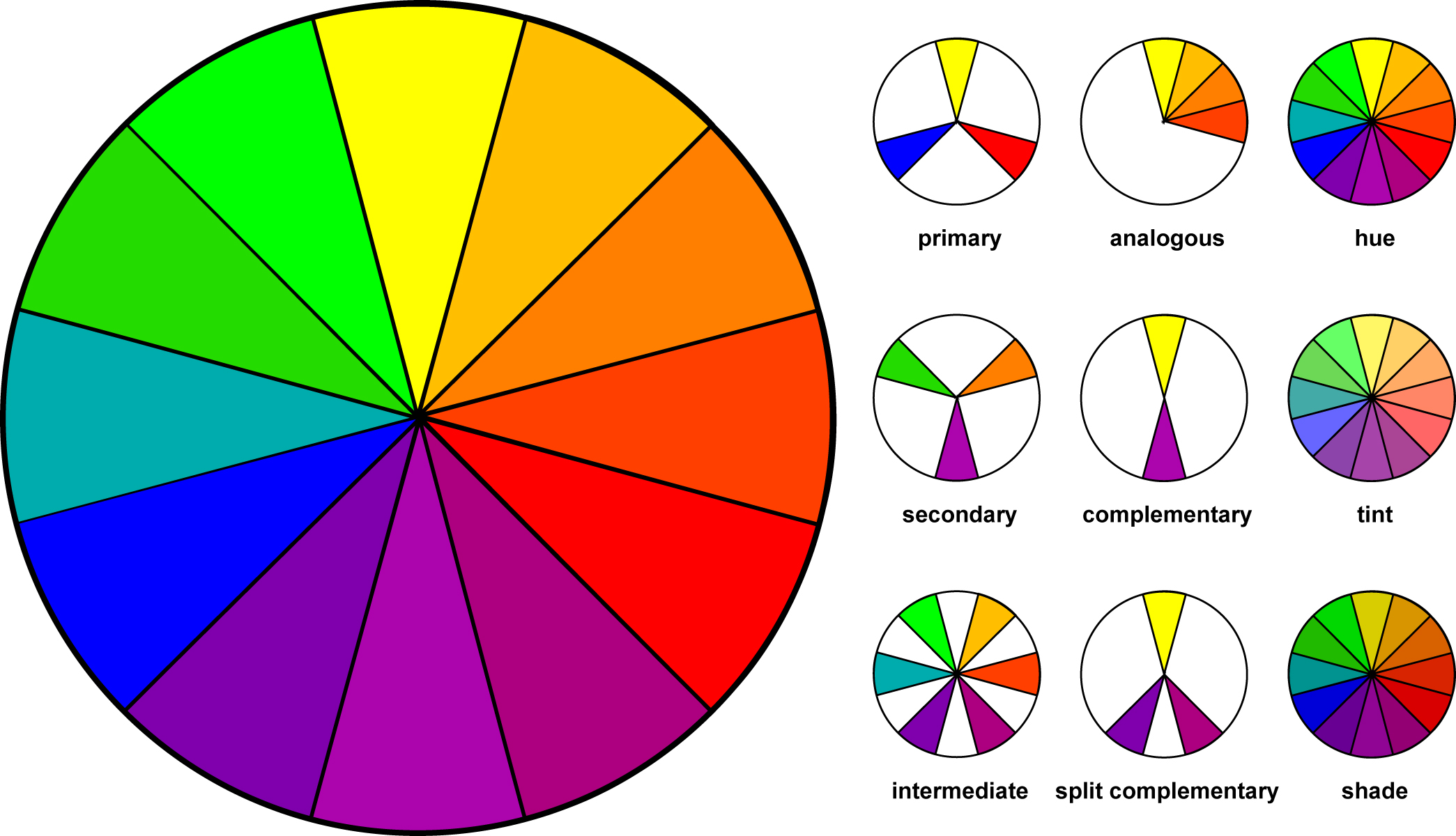
Composition is defined as the arrangement of the elements and principles of design.
How do we make paintings, sculptures, websites, clothing, posters, movies, photographs visually attractive? How do we immediately know that the pants we picked out don’t match the shirt we want to wear? How do we know that one car has a better design than the next car. Those ideas, what could be called aesthetics, are all dealing with composition.
As art students we need to understand what creates good, well organized compositions and the problems we can run into with bad or disorganized compositions. Although introductory courses such as 2D Design and Drawing 1 will stress that you understand and use good design, there are many artists that, once they understand the rules of design, choose to break them. Like with most things in life, we have to understand the rules before we can start to break them.
Well designed compositions can be achieved by understanding how the Elements and Principles of Design work together. The Elements can be described as the parts in a car; the muffler, gas tank, brake pedal, windshield wipers, etc. The Principles are how those parts work together.
As you work, ask yourself –
How does the work of art create __________________ (insert principle) through the use of ___________________ (insert element) ?
For example: How does the work of art create repetition through line? How does the work of art create balance through color? How does the work of art create contrast through value? How does the work of art create movement through space? You could run through one principle with all 7 elements.
How does the work of art create contrast through line? How does the work of art create contrast through shape? How does the work of art create contrast through form? How does the work of art create contrast through value? How does the work of art create contrast through texture? How does the work of art create contrast through space? How does the work of art create contrast through color?
Asking these questions will help you have a better understanding of what is working in your composition and what needs to be adjusted. The principles of design help you to carefully plan and organize the elements of art so that you will hold interest and command attention. Interesting works of art hold the viewer’s attention, visually and/or conceptually.
In any work of art there is a thought process for the arrangement and use of the elements of design. The artist who has an understanding of the principles of good composition will typically create a more interesting work of art . The center of interest will be strong and the viewers will not look away, instead, they will be drawn into the work. A good knowledge of composition is essential to producing good artwork. Some artists today like to bend or ignore these rules and therefore are experimenting with different forms of expression. Composition is hugely important, but like any rule in art, they can be broken.
Line – can be considered in two ways. The linear marks made with a pen or brush or the edge created when two shapes meet. We can all draw a line, but defining it with words becomes more difficult. At its simplest, a line is a mark on a surface that describes a shape or outline. It can create texture and can be thick and thin. Types of line can include actual, implied, vertical, horizontal, diagonal and contour lines.
Form – is a 3-dimensional object having volume and thickness. Form can be real, as in a sculpture or implied, as in a drawing. To imply form you might use light and shading techniques to make a circle look like a sphere. Forms can be viewed from many different angles.
Value – is the degree of light and dark in a design. It is the contrast between black and white and all the tones in between. Value can be used with color as well as black and white. Contrast is the extreme changes between values. Color and value are sometimes confused when starting to study the Elements of Design. Color refers to hue (red, yellow, blue…) while value refers to lightness or darkness only.
Texture – describes surface quality either actual or implied. Actual texture is how something feels when you touch it. A rock feels rough, a feather smooth etc. Implied texture is how an object appears to feel. A drawing of a rock appears/implies that the texture is rough but if we touch the sheet of paper it feels smooth. Texture is the degree of roughness or smoothness in objects and relies heavily on value and lighting. Want to take a really youthful photo of yourself? Point as many lights at your face as possible. The light will “fill” in any wrinkles, washing out the shadows cause by these wrinkles. Lighting your face from a really harsh angle will enhance the texture of your face, creating a photo that is probably not very flattering.
Space – the area in, around, above or below an object. Two types of space exist; positive and negative. Positive space is usually the object being drawn or the darker object while negative space is everything but the object and usually lighter. An easy way to determine which is positive is to ask yourself which are or object do you look at first. That is typically the positive space. Negative or empty space is just as important as positive space.
Color – is the reflected light that we are able to see with our eyes. It also refers to specific hues and has 3 properties, Hue, Chroma and Value. The color wheel is a way of showing the chromatic scale in a circle using all the colors made with the primary triad. Complimentary pairs can produce dull and neutral color. Black and white can be added to produce tints (add white), shades (add black) and tones (add gray).
[/su_spoiler]
[su_spoiler title=”Principles of Design” open=”no” style=”default” icon=”plus” anchor=”” class=””]
Principles of Compositional Design
The principles of design are the recipe for a good work of art. The principles combine the elements to create an aesthetic placement of things that will produce a good design.
Emphasis/Focal Point – is an area that first attracts attention in a composition. This area is more important when compared to the other objects or elements in a composition. This can be by contrast of values, contrasting colors, placement in the artwork (we are naturally drawn to the center), a change from no pattern to pattern.
Balance – is a feeling of visual equality in shape, form, value, color, etc. Balance can be symmetrical or evenly balanced or asymmetrical and un-evenly balanced. Objects, values, colors, textures, shapes, forms, etc., can be used in creating a balance in a composition. A third but seldom used form of balance is what is called radial balance. You can see this type of balance in hubcaps on a car and rose windows in churches.
Unity/Harmony – is the visually satisfying effect of combining similar, related elements. eg. adjacent colors on the color wheel, similar shapes etc. Unity is the relationship among the elements of a work of art that helps all of the elements function together. Unity gives a sense of oneness to a visual image.
Contrast – creates a visual discord in a composition. Contrast is the juxtaposition of opposing elements eg. opposite colors on the color wheel – red / green, blue / orange etc. Contrast in tone or value – light / dark. Contrast in direction – horizontal / vertical. The major contrast in a work of art should be located at the center of interest, your focal point. Too much contrast scattered throughout a painting can destroy unity and make a work difficult to look at. Unless a feeling of chaos and confusion are what you are seeking, it is a good idea to carefully consider where to place your areas of maximum contrast.
Movement – is a visual flow through the composition. It can be the suggestion of motion in a design as you move from object to another object by they are placed or their position in relationship to another object. Directional movement can be created through implied lines (dotted lines), a change in value (moving from light to dark), a change in color (red to red orange to orange), a change in scale (small to large). There can be implied movement (a light source in a painting that helps guide our eyes through the composition) or actual/physical movement (a sculpture that actually moves).
Pattern/Rhythm – is the use of similar elements again and again. If you repeat a line or shape over and over, you are visually creating a beat, a sense of timing for the viewer. Think plaid shorts or striped shirt. Sometimes this can become monotonous. The monotony can be broken while still maintaining a sense of pattern by keeps one element through similar but adjusting another element. If you have 50 square that were all the same size but painted each one a different color, you still create a pattern but a much more engaging pattern. Pattern can be combined with movement.
Variety – provides contrast to harmony and unity. If you have a grid of 1,000 black and white squares you have unity through shape. If you paint one of those squares red, you’ve just introduced variety. Most viewers will look directly at the red square first simply because it’s different. Art needs a combination of unity and variety. Too much unity and it can become boring. Too much variety and it becomes chaotic.
Proportion/Scale – Proportion is the size relationship of parts to a whole and to one another. Babies are cute because their heads and eyes are so large when compared to the rest of their body. Their head and eyes are not in proportion to the rest of their body. Whenever you start a drawing, you can check proportions by comparing one object to another and asking if it’s too big, too small, too flat, too round… Scale refers to relating size to a constant, such as a human body. If you look on the box of a model car kit, you’ll see numbers such as 1:24th scale. This means that the car in the box with be 1/24 the size of a real car. Some artworks work better on a small scale (creates intimacy) while others on a much larger scale (commands attention).
The videos linked below are good visual guides for understanding the principles defined above but not everyone agrees on the list of principles. For this class we will use the ones outlined above but keep in mind that they are flexible.
[/su_spoiler]
Color is complicated. To better understand how to use it in your work there are additional resources and videos below.
Color in design is very subjective. What evokes one reaction in one person may evoke a very different reaction in someone else. Sometimes this is due to personal preference, and other times due to cultural background. Color theory is a science in itself. Color is also the most difficult but also the most powerful of the 7 elements of design. It can make someone feel sad or happy. It can make you want to eat more or not at all. It can imply life or death. It can encourage learning and also do just the opposite. Color is complicated. One tiny shift from blue-green to a slightly greener blue-green can change how you interpret or how you feel about a work of art. There are entire books written on the psychology of color and color theory. This section will introduce you to some of those thoughts as well as illustrate various ways to use color in your work. What follows focuses predominately on color that can be mixed using paint or colored pencils. Colored lights work very different when mixed.
Color can be broken down into Hue, Chroma (Saturation) and Value.
Hue – the color itself; red, blue yellow. We don’t talk about dark or light when referring to Hue, just the color.
Chroma / Saturation – Is the red a really strong red or is it more washed out than a real red? Saturation is the intensity of the color. A red straight from a tube of paint is very saturated but when you mix it with white or thin it with water, the saturation lessens.
Value – the lightness or darkness. A light yellow may appear more lemon while a dark yellow may appear more mustard.
Primary – The three most basic colors are Red, Yellow and Blue. These are known as Primary colors. There is nothing you can use to mix these colors, however you can use these three colors (and sometimes white) to mix almost every color in the world. If you are short on money, you only need to buy red, yellow, blue and white.
Secondary – Mixing any two Primaries creates a Secondary color. Secondaries include Orange, Green and Violet (Purple).
Tertiary – Mixing a Primary and a Secondary creates a Tertiary (sometimes called Intermediate). Tertiaries are named with their primary color first and secondary color last. If I mix Red and Violet, I get a Red-Violet. Although Violet-Red is technically the same color, we always name them with the Primary name first. Blue and Green = Blue-Green. Yellow and Orange = Yellow-Orange.
Warm colors include red, orange, and yellow, and variations of those three colors. These are the colors of fire, of fall leaves, and of sunsets and sunrises, and are generally energizing, passionate, and positive.
Red and yellow are both primary colors, with orange falling in the middle, which means warm colors are all truly warm and aren’t created by combining a warm color with a cool color. Use warm colors in your designs to reflect passion, happiness, enthusiasm, and energy.
Red (Primary Color)
Red is a very hot color. It’s associated with fire, violence, and warfare. It’s also associated with love and passion. In history, it’s been associated with both the Devil and Cupid. Red can actually have a physical effect on people, raising blood pressure and respiration rates. It’s been shown to enhance human metabolism, too.
Red can be associated with anger, but is also associated with importance (think of the red carpet at awards shows and celebrity events). Red also indicates danger (the reason stop lights and signs are red, and that most warning labels are red).
Outside the western world, red has different associations. For example, in China, red is the color of prosperity and happiness. It can also be used to attract good luck. In other eastern cultures, red is worn by brides on their wedding days. In South Africa, however, red is the color of mourning. Red is also associated with communism. Red has become the color associated with AIDS awareness in Africa due to the popularity of the [RED] campaign.
In design, red can be a powerful accent color. It can have an overwhelming effect if it’s used too much in designs, especially in its purest form. It’s a great color to use when power or passion want to be portrayed in the design. Red can be very versatile, though, with brighter versions being more energetic and darker shades being more powerful and elegant.
Orange (Secondary Color)
Orange is a very vibrant and energetic color. In its muted forms, it can be associated with the earth and with autumn. Because of its association with the changing seasons, orange can represent change and movement in general.
Because orange is associated with the fruit of the same name, it can be associated with health and vitality. In designs, orange commands attention without being as overpowering as red. It’s often considered more friendly and inviting, and less in-your-face.
Yellow (Primary Color)
Yellow is often considered the brightest and most energizing of the warm colors. It’s associated with happiness and sunshine. Yellow can also be associated with deceit and cowardice, though (calling someone yellow is calling them a coward).
Yellow is also associated with hope, as can be seen in some countries when yellow ribbons are displayed by families who have loved ones at war. Yellow is also associated with danger, though not as strongly as red.
In some countries, yellow has very different connotations. In Egypt, for example, yellow is for mourning. In Japan, it represents courage, and in India it’s a color for merchants.
In your designs, bright yellow can lend a sense of happiness and cheerfulness. Softer yellows are commonly used as a gender-neutral color for babies (rather than blue or pink) and young children. Light yellows also give a more calm feeling of happiness than bright yellows. Dark yellows and gold-hued yellows can sometimes look antique and be used in designs where a sense of permanence is desired.
Cool colors include green, blue, and purple, are often more subdued than warm colors. They are the colors of night, of water, of nature, and are usually calming, relaxing, and somewhat reserved.
Blue is the only primary color within the cool spectrum, which means the other colors are created by combining blue with a warm color (yellow for green and red for purple). Greens take on some of the attributes of yellow, and purple takes on some of the attributes of red. Use cool colors in your designs to give a sense of calm or professionalism.
Green (Secondary Color)
Green is a very down-to-earth color. It can represent new beginnings and growth. It also signifies renewal and abundance. Alternatively, green can also represent envy or jealousy, and a lack of experience.
Green has many of the same calming attributes that blue has, but it also incorporates some of the energy of yellow. In design, green can have a balancing and harmonizing effect, and is very stable. It’s appropriate for designs related to wealth, stability, renewal, and nature. Brighter greens are more energizing and vibrant, while olive greens are more representative of the natural world. Dark greens are the most stable and representative of affluence.
Blue (Primary Color)
Blue is often associated with sadness in the English language. Blue is also used extensively to represent calmness and responsibility. Light blues can be refreshing and friendly. Dark blues are more strong and reliable. Blue is also associated with peace, and has spiritual and religious connotations in many cultures and traditions (for example, the Virgin Mary is generally depicted wearing blue robes).
The meaning of blue is widely affected depending on the exact shade and hue. In design, the exact shade of blue you select will have a huge impact on how your designs are perceived. Light blues are often relaxed and calming. Bright blues can be energizing and refreshing. Dark blues are excellent for corporate websites or designs where strength and reliability are important.
Violet – Purple (Secondary Color)
Purple was long associated with royalty. It’s a combination of red and blue, and takes on some attributes of both. It’s associated with creativity and imagination, too.
In Thailand, purple is the color of mourning for widows. Dark purples are traditionally associated with wealth and royalty, while lighter purples (like lavendar) are considered more romantic.
In design, dark purples can give a sense wealth and luxury. Light purples are softer and are associated with spring and romance.
Neutral colors often serve as the backdrop in design. They’re commonly combined with brighter accent colors. But they can also be used on their own in designs, and can create very sophisticated layouts. The meanings and impressions of neutral colors are much more affected by the colors that surround them than are warm and cool colors.
Black
Black is the strongest of the neutral colors. On the positive side, it’s commonly associated with power, elegance, and formality. On the negative side, it can be associated with evil, death, and mystery. Black is the traditional color of mourning in many Western countries. It’s also associated with rebellion in some cultures, and is associated with Halloween and the occult.
Black is commonly used in edgier designs, as well as in very elegant designs. It can be either conservative or modern, traditional or unconventional, depending on the colors it’s combined with. In design, black is commonly used for typography and other functional parts, because of it’s neutrality. Black can make it easier to convey a sense of sophistication and mystery in a design.
White
White is at the opposite end of the spectrum from black, but like black, it can work well with just about any other color. White is often associated with purity, cleanliness, and virtue. In the West, white is commonly worn by brides on their wedding day. It’s also associated with the health care industry, especially with doctors, nurses and dentists. White is associated with goodness, and angels are often depicted in white.
In design, white is generally considered a neutral backdrop that lets other colors in a design have a larger voice. It can help to convey cleanliness and simplicity, though, and is popular in minimalist designs. White in designs can also portray either winter or summer, depending on the other design motifs and colors that surround it.
Gray
Gray is a neutral color, generally considered on the cool end of the color spectrum. It can sometimes be considered moody or depressing. Light grays can be used in place of white in some designs, and dark grays can be used in place of black.
Gray is generally conservative and formal, but can also be modern. It is sometimes considered a color of mourning. It’s commonly used in corporate designs, where formality and professionalism are key. It can be a very sophisticated color. Pure grays are shades of black, though other grays may have blue or brown hues mixed in. In design, gray backgrounds are very common, as is gray typography.
Brown
Brown is associated with the earth, wood, and stone. It’s a completely natural color and a warm neutral. Brown can be associated with dependability and reliability, with steadfastness, and with earthiness. It can also be considered dull.
In design, brown is commonly used as a background color. It’s also seen in wood textures and sometimes in stone textures. It helps bring a feeling of warmth and wholesomeness to designs. It’s sometimes used in its darkest forms as a replacement for black, either in backgrounds or typography.
Beige and Tan
Beige is somewhat unique in the color spectrum, as it can take on cool or warm tones depending on the colors surrounding it. It has the warmth of brown and the coolness of white, and, like brown, is sometimes seen as dull. It’s a conservative color in most instances, and is usually reserved for backgrounds. It can also symbolize piety.
Beige in design is generally used in backgrounds, and is commonly seen in backgrounds with a paper texture. It will take on the characteristics of colors around it, meaning it has little effect in itself on the final impression a design gives when used with other colors.
Cream and Ivory
Ivory and cream are sophisticated colors, with some of the warmth of brown and a lot of the coolness of white. They’re generally quiet, and can often evoke a sense of history. Ivory is a calm color, with some of the pureness associated with white, though it’s a bit warmer.
In design, ivory can lend a sense of elegance and calm to a site. When combined with earthy colors like peach or brown, it can take on an earthy quality. It can also be used to lighten darker colors, without the stark contrast of using white.
Above is the basic 12 spoke color wheel. 3 primaries, 3 secondaries and 6 tertiaries. There are millions of different colors but it is thought that our eye can distinguish about 2.4 million different colors and even more under different types of lighting. Listed below are some basic color theories that should help you create better looking works of art and to have a better understanding of why some colors work and why others do not.
The woman in the video below…is a little excited about color, but knowing that she was one of the lead graphic designers for Google and YouTube means she knows what she’s talking about. Just turn the volume down a little as you watch it.
Monochromatic
Monochromatic color schemes are made up of different tones, shades and tints within a specific hue. These are the simplest color schemes to create, as they’re all taken from the same hue, making it harder to create a jarring or ugly scheme (though both are still possible).
Analogous
Analogous color schemes are the next easiest to create. Analogous schemes are created by using three colors that are next to each other on the 12-spoke color wheel. Generally, analogous color schemes all have the same chroma/intensity level, but by using tones, shades and tints we can add interest to these schemes and adapt them to our needs for creating works of art.
Complementary
Complementary schemes are created by combining colors from opposite sides of the color wheel. In their most basic form, these schemes consist of only two colors, but can easily be expanded using tones, tints, and shades. A word of warning, though: using colors that are exact opposites with the same chroma and/or value right next to each other can be very jarring visually (they’ll appear to actually vibrate along their border in the most severe uses). This is best avoided (either by leaving white space between them or by adding another, transitional color between them).
Beige and brown are really tints and shades of orange
Split Complementary
Split complementary schemes are almost as easy as the complementary scheme. In this scheme, instead of using colors that are opposites, you use colors on either side of the hue opposite your base hue.
Triadic
Triadic schemes are made up of hues equally spaced around the 12-spoke color wheel. This is one of the more diverse color schemes.
Making sure that you accurately document your work is important for the development of your portfolio, job applications, exhibition submissions and more. When documenting your work you are not making a work of art – no filters, no sunsets or sunrises, no cool effects – just straight, accurate documentation.
When photographing large scale sculptures or works that are difficult to set up, shoot lots of photos. Shoot from multiple angles, try out different settings, bulbs. It is better to have too many images to choose from then not enough.
If you would like to work through some sample files you may download 2 RAW images of Mark Mcleod’s work from here – Photographing Work Sample Files.zip (65mb) You will get a pop up saying that there is no preview available or that it can’t scan for viruses. Click Download. If you don’t get a pop up and instead have what looks like a file folder system, you should have a download button in the top right.
DSLR vs Smart Phone
Smart phones have advanced to the point that, in a pinch, they can be used to document your work. Newer iPhones (7 and above) and Android (Samsung S9) both have amazing cameras that are convenient because we always have them with us. There are some instances though when a smart phone just isn’t enough – low light situations, colors that need be accurate, highly textured objects. In these situations a DSLR is going to give you much better results. In general, use a DSLR.
Smartphones
DSLR with additional Equipment
Lighting
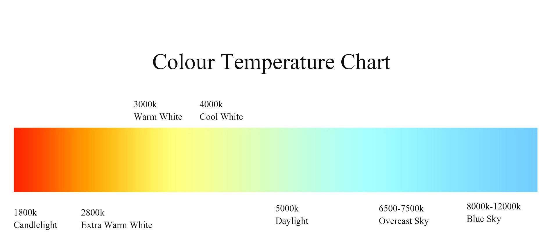
When photographing your works you want your lighting to be as close to daylight as possible. If your work is small and you are shooting indoors, use daylight bulbs. Bulbs are rated according to how warm or cold they appear and measured in Kelvin. A 2000k bulb will appear warm while a 6000k bulb will appear blue. Daylight changes but on average you want a 5600k bulb for natural daylight.
When photographing larger work outdoors, try to avoid sunset and sunrise because the colors will be much warmer. Avoid harsh shadows – an overcast day is usually the best time to photograph.
If you are photographing indoors and can control your lights, make sure that you are using the same bulbs in every light source. This might mean turning off the overheads or blocking out windows so you don’t have an odd shift in color. Try to light from both sides at a 45 degree angle and pay close attention to any shadows that may appear.
Color Calibration
Color is probably the most crucial element when documenting your work and there is a lot to think about.
The color of your work
The color of your bulbs or daylight
The color of your images
The color of your computer screen
The color of your output (website, printer, projector, tv)
We need to control of many of these as possible. We’ve discussed how to control the first two. Controlling the color of your images is done through color calibration. This can be done by eye but if your work contains a lot of nuanced colors, it is best to purchase a color card and use additional software. The lighting in your room, the light coming in from the windows, your monitor, and the new Night Shift on Macs and Windows all affect how we perceive color. The video below explains the process of using a SpyderCheckr color card and Adobe Lightroom (Classic) to accurately correct colors.
* Tip – Adobe Lightroom CC and Adobe Lightroom Classic are two different pieces of software. Lightroom CC is designed for syncing to cloud and is mobile friendly but not as advanced as Lightroom Classic. For this particular demo you want Lightroom Classic.
Calibrating your computer screen is also important. If the colors you see on your monitor aren’t accurate, trying to calibrate photos in Photoshop or Lightroom will be almost impossible. Mac computers have a built in “by eye” calibration tool that works but is somewhat limited. It is located under Settings > Displays > Color > Calibrate. In older versions of Mac OS the color calibration was more advanced but in newer operating systems it leaves out a lot. There are hardware devices that attach to your monitor that measure for color accuracy with one of the best being from the same company that makes the color card used in the video above – Spyder They start at $170. An alternative is to have the work sitting in front of you as you edit to make sure you get the colors as accurate as possible.
Photographing your work
When you are photographing your work, whether indoors or out, pay attention to your surroundings. Is there a piece of trash or extension cord in the background? Is there something on the table such as paint marks or clutter that will make the piece harder to read? Will you be able to document the work so that the viewer understands what they are looking at? Will you need more than just a front angle?
Editing in Photoshop
You always want to edit your images at the largest file size that your camera and computer can handle. Save compression, resizing and converting to other formats until you are done editing.
Saving your images
Originals, Edited, For Web, For Print. Use an external drive to backup your work – either Time Machine for Macs or my personal favorite, Carbon Copy Cloner.
Students will learn about drawing and modifying filled vector shapes with the selection and pathfinder tools.
Students will learn how to transform, reflect, duplicate, arrange, align, distribute, expand the appearance of paths into shapes, and group multiple shapes together as one unit.
Key commands for this exercise are written for a Mac keyboard. To work on a PC, please review the chart below for necessary substitutions:
Mac
PC
Command ( / Apple key)
Ctrl (Windows)
Option
Alt
Control
Control
Project
Be sure to watch the demo video on D2L as you work on this exercise!
Part 1: Drawing, Duplicating, Aligning, Distributing, and Grouping Shapes
Create a New File in Illustrator with (1) 10” x 10” artboard (File > New…) Select RGB color space, 300ppi resolution.
Label the file LastName_FirstName Exercise 1.ai (Example: Anfinson_Erin Exercise 1.ai)
Change your Workspace to Painting (Window > Workspace > Painting)
In the Layers panel, double click the Layer name to activate it, change the name to 64 circles.
Select the Ellipse (L) tool and click on the Artboard. Draw a 1”x1” circle in the new dialogue box. Fill with the color of your choice. To change the lightness or darkness of the color you select, double click the Fill paint chip in the toolbar and select the value of your choice.
Use the Selection tool (V) to drag the circle up to the upper left corner.
Keep the Selection tool active and duplicate the circle by holding the Option key and dragging a new circle to the right. Continue duplicating until you have 8 circles.
Align the circles by selecting them all (Command A or click and drag around all), then open the Align tools by going to Window > Align. If needed, expand the Align menu to show “Align to” and select “Selection” from the drop down menu. Finally, click Vertical Align Center.
Distribute the circles evenly between each other by keeping them all selected and clicking on Horizontal Distribute Center in the Alignment Window.
Group the line of circles together by keeping them all selected and going to Object . Group (Command G).
Duplicate the grouped line of circles eight times using the Selection tool and Option key method. Drag each new line of circles further down the artboard.
Select all eight lines of circles and use the Horizontal Align Center and Vertical Distribute Center tools to align them on the artboard.
Group all of the lines of circles together by hitting Command G on your keyboard.
Use the Direct Selection tool (A) to change the individual colors of circles in the group. To select multiple circles, hold the Shift key while making the selection.
Save your work by going to File > Save or hitting Command S
TIP: To skip using the Align tool so much, simply hold the Shift + Option key while dragging the duplicate shapes.
Part 2: Drawing and modifying a variety of shapes
Drawing a variety of shapes
Create a new 11” x 17” Artboard using the Artboard tool.
Create a new Layer in the layers panel and label it Shape Combinations
Zoom in to the top portion of the Artboard by holding Z and click-dragging your mouse to the right (zoom in) or left (zoom out). You can also Zoom by hitting Command + or – on your keyboard.
Use the Rectangle (M), Ellipse (L), the Star (hidden under Rectangle tool, click and hold to reveal), and a freely drawn shape with the Pencil tool (N). Each shape should only be about 2” in its longest dimension. Fill the shapes with the same color.
Use the Text tool (T) to type Shape Library near this row of shapes near your example
Save your work (Command S)
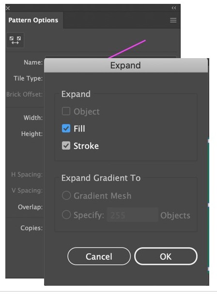
Expanding linear vector paths into shapes
Use the Pencil tool (N) to draw an squiggly path with a stroke width of 16 and a non-uniform width variation.
Use the Selections tool (V) to Option-drag a duplicate of your path next to it.
Turn the duplicated path into a filled shape by going to Object > Expand Appearance
Your vector path is now a filled shape. Select it with the Direct Selection tool (A) to see the anchor points.
Use the Text tool (T) to type Expanded Line near your example
Save your work (Command S)
Modifying shapes with the Direct Selection and Add/Subtract Anchor Point tools
Use the Selection tool (V) to Option-drag a duplicate of your ellipse shape below the row of original shapes at the top the artboard. Change the shape’s fill color.
Activate the Direct Selection tool (A) to reveal the shape’s anchor points.
Double-click one the anchor points on the shape to activate it and move it. You can also change the curve by dragging on the revealed Bezier Curves.
Next, activate the Add Anchor Point tool (nested beneath the Pen tool), and add an anchor point anywhere on the shape path. Use the Direct Selection tool (A) to move and/or pull on the curve of the new anchor point.
Finally, activate the Delete Anchor Point tool (nested beneath the Pen tool), and delete an anchor point anywhere on the shape path.
Use the Text tool (T) to type Modified Shape near your example
Save your work (Command S)
Part 3: Using the Transform tools to rotate, resize, and reflect shapes
Resizing shapes
Use the Selection tool (V) to Option-drag the splat shape from the shape library to an open space at below on the Artboard. Change shape’s fill color
Use the Selection tool (V) to resize the splat shape by dragging one of the corner handles on the outlined frame and hold the Shift key while dragging to constrain the shape’s proportions.
Rotating shapes
Using the same rescaled shape, select the shape with the Selection tool (V) and activate the Rotation tool (R).
Click and drag the rotation of the splat shape to a new rotation angle. Tip: Holding the Shift key while dragging locks in only 45° angles while you drag.
Don’t want the shape to rotate from the center? Change the rotation anchor point by clicking and dragging it to another place on the shape while the Rotation tool is active.
Reflecting shapes
Using the same rescaled & rotated splat shape, select the shape with the Selection tool (V).
Click on the Reflect tool (hidden under the Rotate Tool) or by hitting O on the keyboard
Decide what axis line you’d like the shape to reflect across. (vertical, horizontal, diagonal?). Then, click the one end of the invisible axis line, hold the shift key and click the other end of the invisible axis line. The shape will reflect across this invisible axis line.
Save your work (Command S)
Part 4: Using the Pathfinder and other tools to Unite, Divide, and cut shapes
Combining shapes with grouping
Use the Selection tool (V) to Option-drag a duplicates of each of your of original shapes in the shape library to an open space at below on the Artboard. Change all shapes’ fill color.
Use the Selection tool (V) to arrange the shapes in any interesting, overlapping combination.
Select all of the shapes and go to Object > Group or type Command G on your keyboard to group the shapes.
To Ungroup the shapes, select the group, and go back to Object > Ungroup or hold Shift Command G on your keyboard.
Use the Text tool (T) to type Grouped Shape near your example
Save your work (Command S)
Unite Shapes
Use the Selection tool (V) to Option-drag a duplicates of each of your of original shapes in the shape library to an open space at below on the Artboard. Change all shapes’ fill color.
Use the Selection tool (V) to arrange the shapes in any interesting, overlapping combination.
Select all of the shapes and go to Window > Pathfinder to open the Pathfinder tool palette.
Select the Unite option from the Shape Modes section of the Pathfinder menu. All of the overlapped shapes are now be combined in to a single shape.
NOTE: this cannot be “ungrouped” like the previous grouping example.
Use the Text tool (T) to type United Shape near your example
Save your work (Command S)
Dividing shapes with drawn paths
Use the Selection tool (V) to Option-drag a duplicate of a rectangle shape from the shape library to an open space at below on the Artboard. Change shape’s fill color.
Use the Pencil tool (N) to draw a path across the entire rectangle.
Go to Window > Pathfinder to open the Pathfinder tool palette, if not already open.
Select the rectangle shape and the drawn path, then click on the Divide option in the Pathfinders section of the Pathfinder menu.
Keep the divided shape selected and go to Object > Ungroup to ungroup and separate the newly divided shapes.
Use the Text tool (T) to type Divided Shape near your example
Save your work (Command S)
Dividing shapes with the Knife tool
Use the Selection tool (V) to Option-drag a duplicate of an ellipse shape from the shape library to an open space at below on the Artboard. Change shape’s fill color.
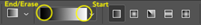
Select the Knife tool (under the Eraser tool) to draw a path across the entire rectangle.
For a curved cut, drag the Knife tool across the shape in any curvilinear path.
Go to Select > Deselect or hold Shift/Command/A on the keyboard
Use the Selection tool (V) to separate the cut shapes.
For a straight cut, hold the Option key while dragging the knife tool. Then follow steps 4 and 5 to separate and move the cut shapes.
Use the Text tool (T) to type Knife-Cut Shape near your example
Save your work (Command S)
Minus front to cut holes through shapes
Use the Selection tool (V) to Option-drag a rectangle and star shapes from the shape library to an open space at below on the Artboard. Change shapes’ fill colors to 2 different colors.
Use the Selection tool (V) to resize the rectangle shape to be smaller than the star shape and duplicate it 3 times. Arrange these small rectangles entirely within the borders of the star shape.
Make sure these rectangles are on top of the star shape. If not, use the Send Back command, Command [ as many times as needed to send the star shape behind the rectangles.
Go to Window > Pathfinder to open the Pathfinder tool palette, if not already open.
Select all of the shapes, then click on the Minus Front option in the Shape Mode section of the Pathfinder menu. The rectangles will now be cut out holes in the star shape. Draw another shape with a contrasting color and move it behind the star to see the results.
Use the Text tool (T) to type Minus Front near your example
Save your work (Command S)
Part 5: Independent Exploration
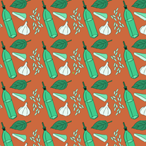
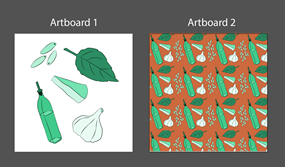
Monochromatic Campus Map Building Shape Design
Use the skills you just learned to create a monochromatic abstract design inspired by the 2D[EA1] shapes of 5 buildings you choose from the MTSU campus map. Start by creating a new 8 1/2” x 11” Artboard in this Illustrator document. Remember to create a new layer in the Layers panel for this design and label it Exercise 1. When drawing your building shapes, use the Unify, divide/knife, Minus Front, Rotate, Reflect, and scaling tools as needed to create your final design. To demonstrate that you used the Minus Front tool to cut holes in 1 or more of your shapes, place other shapes filled with different values from your monochromatic color hue behind the cut out hole(s).
*Monochromatic = only 1 color + tints and shades
In Illustrator, to change the lightness or darkness of the color you select, double click the Fill paint chip in the toolbar and select the value of your choice.
Exercise Requirements (Assessment criteria)
Use of monochromatic color scheme applied to all shape color fills in 5 different values.
Demonstrated use of Minus Front to cut holes in some of the shapes.
Demonstrated use of the Rotation tool
All individual building shape layers must be United shapes
Use at least 3 distinct varied shape sizes (small, medium, large) in design and the background should be addressed and included in the design.
Final design should be grouped and centered on the Artboard and fill the entire artboard
Workspace organization: Layers are labeled and on the correct artboards.
Exporting and submitting your exercise:
When you have finished Exercise 1, go to File > Save As…
Next, select Adobe PDF from the format options.
In the next window, make sure “Preserve Illustrator Editing Capabilities” is checked!
Click Save. Be sure you file is labeled correctly! LastName_FirstName Exercise 1.pdf (Example: Anfinson_Erin Exercise 1.pdf)
Submit the PDF of your completed Exercise 1 file in the class D2L Dropbox
Students will explore Adobe Photoshop workspace Students will demonstrate understanding of the relationship between image size and resolution Students will use non-destructive image editing techniques to preserve original image properties
Exercise Files on D2L:
This handout, demo video, and all exercise .jpegs downloaded to your computer
Tools and techniques covered:
Resolution and image size relationship
Non-destructive editing vs destructive editing
Selecting and importing appropriately sized digital collage materials
Scanning collage materials to the proper resolution / size
Layer management
Layer masking with brushes, selection tools, and work paths
Adjustment layers and creating targeted clipping mask adjustment layers
Exporting and sharing files with WeTransfer.com
Project:
Part 1: Create a new Photoshop document and set up the workspace
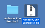
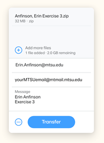
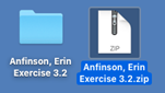
Create a new folder for your Exercise 3 files on your computer’s desktop. Label the folder LastName, FirstName Exercise 3
Open Photoshop and create a new 8”x10,” 300dpi, RGB color space file, White Background. Label your file LastName_FirstName Exercise 3 (Example Anfinson_Erin Exercise 3)
Before you click “Create,” change the document size settings in the drop down menu from Inches to Pixels. Notice the size of your document—2400px x 3000px. Keep this overall pixel x pixel dimension in mind as work on the exercise. Try this handy online calculator for help with Inches Pixel calculations in the future!
Click “Create.”
Immediately Save this file by going to File > Save or hitting Command S on your keyboard and save it to your Exercise 3 folder
Go to Window > Workspace > Essentials
Part 2: Prepare all individual digital collage materials (jpegs)
The provided collage layer images were all downloaded in a variety of different sizes and resolutions that don’t match the 8”x10,” 300ppi collage canvas. To avoid any surprises and better understand the relationship between image size and resolution, you will take an extra step to prepare each separate collage jpeg before copying and pasting it to your final collage canvas.
Open and redistribute the pixels in your digital collage layer jpegs to 300ppi
Leave your 8”x10” document alone and open each digital collage layer jpeg downloaded from D2L separately in Photoshop. To open an image file, go to File > Open… or type Command O on the keyboard. Select an image file and click Open.
Once your image opens, examine its size and resolution in the Image Size dialogue box by going to Image > Image Size…
Determine the overall size and resolution of your collage material. Redistribute the pixels to 300ppi by typing 300 in the resolution box. Make sure that Resample Image is NOT checked! *Take note of the unchanged pixel x pixel dimension and the changed inch x inch dimension of the image. It will be smaller if the image was less than 300ppi.
Save your changes File > Save or Command S
Click Ok on the following jpeg quality menu and keep your image open.
Repeat steps 1-5 for all of your downloaded collage layer images.
TIP: Try this handy online calculator for help with Inches Pixel calculations in the future!
(EXTRA: Not in video… Move on to Part 3)
Rotate & Crop your image, if necessary
Go to Image > Image Rotation > Select the degree you need to rotate your image
Select the Crop tool (C) from the toolbar on the left side of the workspace.
Click & drag the Crop tool to reframe tighter to the object you want to cut out.
To commit to the crop, hit Enter or click the checkmark in the Crop options bar on top of the workspace. TIP: If at any point you want to cancel the crop, hit the ESC key
Spot heal and repair any damaged areas of your image, if necessary (DESTRUCTIVE)
Select the Spot Healing Brush tool (J) from the tools panel. (Looks like a Band aid with a dotted 1/2 circle.)
Look at the Tool options in the bar at the top of the window. Select the type of brush you want and the type of healing mark (Proximity Match) and keep Sample All Layers box unchecked.
Select a small area on your image to heal. Use the left [ and right ] keys to scale the brush lager and smaller. Make the scale of the brush slightly larger than the spot you want to heal.
Click and see what happens! If you are happy with the repair, move on. If not Undo (Command Z) and change the properties of the brush if necessary.
Part 3: Copy and paste individual collage images into main document
Select an open collage image in the Layers panel, go to Edit > Copy or type Command C
Go to your 8”x10” Photoshop document, go to Edit > Paste or type Command V
Your collage layer will be pasted to a new layer in your 8”x10” Photoshop document. WARNING: Do not use the Selection tool (V) to enlarge or shrink the scale of the layer yet!
Double-click the layer in the Layers window and rename the layer
Repeat steps 1-4 for each open collage image
When you are finished, close the individual collage images and save any changes.
Part 4: Non-destructive digital cutting with Layer Masks
Cutting out/around objects
OPTION 1: Use the Lasso tool to draw a selection and create a simple Mask
Select one of your collage material layers to digitally “cut”
Use the Lasso tool (L) from the tool bar and sure the “Add to Selection” option is on in the tool properties bar at the top of the screen.
Click and drag to begin tracing around the border of the image selection you’d like to cut out, holding the Option key while you work. Holding the Option key will allow you to pause and add to your selection!
If you need to add small areas of the selection after it is closed, keep the Add to Selection property selected and simply draw the selection extension, making sure to cross the original path.
If you need to remove small areas of the selection after it is closed, activate the Subtract from Selection property and draw the selection area to be removed. TIP: This is a great way to make holes!
When your selection is ready, create a Mask on your layer by clicking on the Add Layer Mask icon in the lower toolbar of the Layers panel.
Your selected image will be masked out and a new mask will be created next to the image in the layers panel. Notice that everything that was masked out is black and your image selection is white.
Save your work (Command S).
OPTION 2: Use the Quick Selection tool to draw a selection and create a simple Mask
Select one of your collage material layers to digitally “cut”
Use the Quick Selection (W) tool from the tool bar and begin dragging the tool over the area of the image you’d like to cut out. Change the brush size for the tool with the bracket keys [ & ].
Refine the selection with the + and – options on the Quick Selection tool. You can access the – option by holding the Option key on your keyboard. It may take a few passes and brush size changes over the object to get the results you want.
To correct small areas of the selection, use the Lasso tool, making sure the “Add to Selection” option is on.
When your selection is ready, create a Mask on your layer by clicking on the Add Layer Mask icon in the lower toolbar of the Layers panel.
Your selected image will be masked out and a new mask will be created next to the image in the layers panel. Notice that everything that was masked out is black and your image selection is white.
Save your work (Command S).
OPTION 3: Use the Lasso or Quick Selection tool to draw and save a reusable Path
Select another one of your collage material layers to digitally “cut”
Click on the Paths tab in the Layers panel
Use the Quick Selection (W) or Lasso tool (L) to create a selection as in the previous examples.
When you are finished drawing the selection, save the selection as a reusable Path by clicking on the flyout menu in the upper right portion of the Paths panel. In the flyout menu, Select the Make Work Path > Tolerance level 1 pixel > Click OK or click on the Make Work Path icon in the in the lower toolbar of the Paths panel.
Double-click the new path to name it and save it.
Keep your newly named path selected and click on the Load Path as a Selection icon in the lower toolbar of the Paths panel.
When your selection is ready, click on the Layers tab, make sure the correct layer is selected, and create a Mask on your layer by clicking on the Add Layer Mask icon in the lower toolbar of the Layers panel.
Your selected image will be masked out and a new mask will be created next to the image in the layers panel. Notice that everything that was masked out is black and your image selection is white.
Save your work (Command S).
OPTION 4: Use the Pen tool to draw and save a reusable Path
Select another one of your collage material layers to digitally “cut”
Click on the Paths tab in the Layers panel
Use the Pen tool (P) tool from the tool bar to draw a path around the image you’d like to cut out. Remember to click and drag to pull the Bezier curve handles to best fit the curves you are tracing and close the path. The path you draw will appear in the Paths panel as a Work Path.
You can use the Direct Selection tool (A) and/or the Add/Delete Anchor point tools to alter the path where needed.
Double-click the Work Path to name it and save it.
Keep your newly named path selected and click on the Load Path as a Selection icon in the lower toolbar of the Paths panel.
When your selection is ready, click on the Layers tab, make sure the correct layer is selected, and create a Mask on your layer by clicking on the Add Layer Mask icon in the lower toolbar of the Layers panel.
Your selected image will be masked out and a new mask will be created next to the image in the layers panel. Notice that everything that was masked out is black and your image selection is white.
Save your work (Command S).
Bonus! Need to Reverse or Invert a layer mask?
Double click the mask icon to reveal its properties, scroll to the bottom of the panel window and click Invert. Or simply hit Command I on your keyboard.
Altering and fine tuning masks with white and black paint
When using Masks to non-destructively cut images in Photoshop, black and white paint are the only colors you will use in the foreground color.
Black= Remove image on Mask White = Add image on Mask
OPTION 1: Use the Brush tool (B)
Keep the mask for your collage layer activated
Select your Brush tool (B) and notice that your color choices are only black and white
Check out the Brush tool settings in the upper toolbar and set to the desired setting. Example: Size 3, Mode: Normal, Opacity 100%, Flow 100%.
Open the Brush Size drop down menu and change the hardness to 100% for our current purposes.
Use black paint and brush to remove areas of the image you want to disappear. Remember you can change the size of the brush using the [ & ] keys!
Change the foreground color to white, and try painting areas of the mask to replace the image.
Experiment with different brush settings for different effects.
Finish fine tuning the edges of your mask and save your work.
OPTION 2: Fill selected shapes with black paint to create holes through images
Select a layer from the layer stack to cut a hole through.
Create a mask by clicking on the Add Layer Mask icon in the lower toolbar of the Layers panel. Keep the layer mask activated.
Use any of the already covered selection tools to create a hole shape in your image. Look for interesting areas to create “windows” to lower layers. i.e. doors, windows, glasses, binoculars, etc…
Once our selection is made, activate the Paint Bucket tool (G), make sure your foreground color is Black (Press D on the keyboard to reset the color chips) and click inside your selection to fill the mask with black and cut the hole.
Deselect (Command D)
Save your work (Command S)
Part 5: Scale, Rotate, Flip, Duplicate, and Group your collage layers
Now that your collage layers are cut out, it’s time to have some fun transforming them on your digital canvas!
Transform the scale of your layer
Select one of your masked collage layers with the Move tool (V). A frame should appear around your layer. *If not, check Show Transform Controls in the top tool properties bar or hit Command T to activate the transformation tools.
Hold the Shift key down, then click and drag a corner of your layer to reduce its scale while keeping it’s proportion. Do not let go of the Shift key until you are done dragging!
As you are dragging notice the percentage changes in the top tool properties bar. Do not enlarge your image past 100% or it will look pixelated and blurry. If you need a larger image, you must start with a higher resolution download or scan.
Hit Enter on your keyboard to accept the transformation or click the in the toolbar. To cancel a scale transformation, click the icon.
Save your work (Command S)
Rotate your layer
Select one of your masked collage layers with the Move tool (V). A frame should appear around your layer. *If not, check Show Transform Controls in the top tool properties bar or hit Command T to activate the transformation tools.
With the Move tool, hover the cursor outside of one corner of the collage layer to activate the rotation tool. Click and drag to the desired rotation. TIP: If you hold the Shift key while you rotate, the layer will rotate at 45° angles.
Hit Enter on your keyboard to accept the transformation or click the in the toolbar. To cancel a scale transformation, click the icon.
Save your work (Command S)
Flip/Mirror your layer
Select a cut collage layer with the Move tool
Go to Edit > Transform… > Flip Horizontally (or vertically)
Save your work (Command S)
Other Transformation tools
For more Transformation tools, and/or precise transformations to your layers, go to Edit > Transform > and select your tool from the flyout menu.
Duplicating layers
Holding the Option key, select a cut collage layer with the Move tool (M). A second white cursor will pop up.
Drag the duplicate of the collage layer elsewhere on the canvas. Notice where it appears in the Layers panel and rename if necessary for organization.
Repeat for as many duplicates as you’d like.
Save your work (Command S)
Group collage layers in a folder
If you’re Layers panel is getting cluttered with a lot of duplicates, you may want to Group them in a folder so they move as one unit on your composition.
Select a multiple cut collage layers or duplicate layers with the Move tool. Hold the Shift key as you select each additional layer.
Open the upper right flyout menu in the Layers panel and select “New Group from Layers…” or type Command G on your keyboard.
Name your new group in the pop-up window and hit Ok.
Your group folder is now in the Layers Panel.
Save your work (Command S)
Moving or Transforming individual layers in a group
If you need to adjust the position or transformation of an individual layer in a group folder, do the following.
Twirl open the Group folder in the Layers panel and select the layer or layers you’d like to adjust. TIP: To select multiple layers, hole the Command key while selecting.
Hit Command T on your keyboard to activate the Transformation properties. Then move, rescale, rotate, etc. the individual group layer.
Hit Enter on your keyboard to accept the transformation or click the in the toolbar. To cancel a scale transformation, click the icon.
Save your work (Command S)
Part 6: Using non-destructive Adjustment Layers to alter your digital collage
An adjustment layer applies color and tonal adjustments to your image without permanently changing pixel values. —helpx.Adobe.com
Once your collage materials are arranged, you can use adjustment layers to create controllable non-destructive changes to the color saturation, color balance, and contrast levels of your collage images.
Adding blanket Adjustment Layers to change the color saturation level of your collage
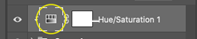
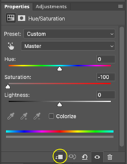
Create a new Hue/Saturation Adjustment Layer by clicking on the Create New Adjustment Layer icon at the bottom toolbar of the Layers panel or go to Layer > New Adjustment Layer > Hue/Saturation…. The adjustment layer will be added to the top of your stack and will affect every layer below it.
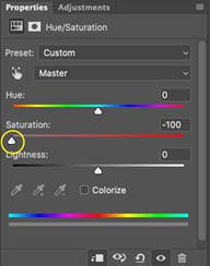
Activate the Adjustment Layer Properties by double clicking the adjustment layer icon.
In the Properties panel, drag the saturation level scale down to reduce the overall image color saturation.
Make adjustments until you are satisfied with your results.
Try activating the Colorize tool in the Adjustment layer properties panel too.
Save your work (Command S)
Adding blanket Adjustment Layers to change the Contrast level of your collage
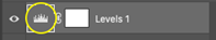
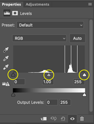
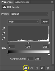
Create a new Levels Adjustment Layer by clicking on the Create New Adjustment Layer icon at the bottom toolbar of the Layers panel or go to Layer > New Adjustment Layer > Levels…. The adjustment layer will be added to the top of your stack and will affect every layer below it.
Activate the Adjustment Layer Properties by double clicking the adjustment layer icon.
In the Properties panel, drag the black, grey, and white sliders to adjust the contrast levels in your collage.
Make adjustments until you are satisfied with your results.
Save your work (Command S)
Adding targeted/clipped Adjustment Layers increase the contrast in 1 individual collage layer
Sometimes you just need to adjust the color or contrast of an individual layer. Through a simple step you can target or clip the adjustment to a a single layer or a group of layers in a folder.
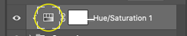
Create a new Hue/Saturation Adjustment Layer by clicking on the Create New Adjustment Layer icon at the bottom of the Layers panel OR go to Layer > New Adjustment Layer > Hue/Saturation…. The adjustment layer will be added to the top of your stack
Drag the Hue/Saturation Adjustment Layer down the layer stack until it is on top of the individual layer or group folder you want to adjust.
Activate the Adjustment Layer Properties by double clicking the adjustment layer icon.
In the Properties panel, click the Create Clipping Mask icon at the bottom of the properties panel.
Any adjustments you make will now be targeted to the single layer or group. Make adjustments until you are satisfied with your results.
Save your work (Command S)
Repeat the above steps with other individual layers or groups and try different adjustment layers.
Save your work (Command S)
Part 7: Wrapping up your collage
After you have completed Parts 1-6, focus on wrapping up your collage and customizing it to with transformations, adjustment layers, duplications, and windows or holes cut through layers. See the requirements below for exercise assessment criteria.
Exercise Requirements (Assessment criteria)
Image size and resolution for all collage layers should be correctly prepared and copied/pasted into the 8”x10” digital collage.
All collage layers should be digitally cut with a mask with no feathering applied to mimic cut paper.
At least 1 layer should have a window or hole cut out to reveal a hidden layer below.
At least 1 layer is duplicated several times and duplicates are grouped in a folder.
At least 1 blanket adjustment layer should be used to change the color or contrast of the entire digital collage.
At least 2 layers or layer groups should have clipped/targeted adjustment layers
Workspace organization: Layers are labeled and on the correct art boards.
A jpeg is correctly exported and included in your exercise submission
Exporting and submitting your exercise:
Export a jpeg
When you have finished Exercise 3, go to File > Export > Quick Export as JPEG
In the Save As dialogue window, navigate to you Exercise 3 folder, label your image LastName_FirstName Exercise 3.jpeg (Example: Anfinson_Erin Exercise 3.jpeg )
Next, click Save.
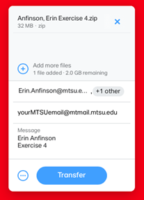
Compress your Exercise files and submit via the free file transfer website, WeTransfer.com
Compress or zip your Exercise 3 folder containing the original Photoshop .psd file & the exported jpeg. On a Mac, select the folder and go to File > Compress “Exercise 3 Folder.” A .zip file will be created next to the folder
Students will familiarize themselves with the Adobe Illustrator workspace
Students will edit and modify drawn paths to create balance
Students will implement proper labeling to keep an organized workspace
Project
In this exercise you will be introduced to the Adobe Illustrator work space, vector paths, and vector path drawing and modification tools.
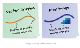
What are vector graphics and why are we using them?
Vector graphics are mathematically calculated paths with anchor points, not a collection of pixels. They are smooth and infinitely scalable.
When you draw a shape it is created with anchor points and a surrounding path that the program mathematically scales up and down
Directions:
Watch the Vector vs. Raster (Pixel) video on D2L
Load the exercise demo video to watch while you complete the exercise.
Create a New File in Illustrator with (4) 8 ½” x 11” artboards (File > New…) Select RGB color space, 300ppi resolution.
Label the file LastName_FirstName Exercise 0.ai (Example: Anfinson_Erin Exercise 0.ai)
Change your Workspace to Painting (Window > Workspace > Painting)
Open the Layers Window (Window > Layers) and create 4 layers by clicking on the “Create New Layer Button.” Label each layer the following by double clicking on the layer name:
Layer 1: Pencil Tool
Layer 2: Pen Tool
Layer 3: Modified Paths
Layer 4: Exercise 1
Save your work by going to File > Save or hitting Command S
Artboard 1 / Layer 1: Drawing vector paths with the Pencil Tool (Command N)
Click the pencil tool to activate
Double Click the pencil tool to alter its properties check only the following:
Move Fidelity slider to Accurate
Keep selected
Option key toggles Smooth Tool
Close paths when ends are within 10 pixels
Select Ok and then draw a heart on your artboard, be sure to fully close the path!
Experiment with changing the fill color, stroke color, stroke weight, and width profile in the top navigation bar
Next, open the pencil tool properties and change the Fidelity to Smooth
Draw another heart and notice the difference in the path smoothness and number of anchor points.
Try using the Smooth Tool to smooth the path or hold Option key while using the Pencil too to engage the Smooth Tool
Artboard 2 / Layer 2: Drawing Vector paths with the Pen Tool (Command P)
Hide Layer 1 in the layers panel and click on Layer 2 to activate
Click the Pen tool to activate
Draw a heart on your artboard with the pen tool by clicking to add anchor points, be sure to fully close the path! To make curves, click, HOLD, and drag Bezier curve handles each time you make a new anchor point.
Experiment with changing the fill color, stroke color, stroke weight, and width profile in the top navigation bar
Draw 2 more hearts on the art board for practice
Artboard 3 / Layer 3: Modify Paths with the Direct Selection, Smoothing, and Anchor Point, Path Eraser, Pencil, Path Join and Width profile tools.
Tool locations:
Direct Selection tool (A)
Smooth tool (under Pencil tool—click and hold to find)
Path Eraser tool (under Pencil tool—click and hold to find)
Path Join tool (under Pencil tool—click and hold to find)
Pencil tool (use pencil tool to connect two open paths)
Add +, Subtract -, and Anchor Point Curves Anchor Point tools (under Pen tool—click and hold to find)
Width Profile tool (Shift W)
Hide the Pen Tool Layer and click on the Modified Paths layers to activate
Use the Pencil tool with accurate Fidelity to draw a closed organic splat shape. Fill the shape with a color of your choice.
Click on the Direct Selection (A) tool to activate the path and anchor points.
Click one of the anchor points and drag it to a new location.
Notice the Bezier curve handles that are also activated—click and drag the handles to change the curve
Finally, try holding the option key, then dragging one of the Bezier curve handles to only move on side of the curve.
Select the Smooth Tool to smooth a portion of the path by clicking and dragging the tool over the section you want to smooth. NOTE: You can change the fidelity of the smooth tool by double clicking it.
Next, activate the Path Eraser tool and use it to erase a portion of your path by clicking and dragging the tool over the area of the path you want to erase.
Next, use the Penciltool (N) to draw a new connection between the path ends.
ALTERNATIVELY…
10. Next, activate the Path Join tool, and rejoin the paths you just erased and split by dragging the tool from one end of the split/erased to its opposite end.
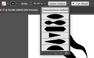
11. Change the general width profile of the drawn path by selecting a preset profile from the drop down menu in the Stroke properties.
12. Custom change the width profile of your drawn path using the Width Profile tool (Shift W). Activate the tool and click anywhere on the path to widen or narrow the width of the stroke. TIP: Hold the Option key while dragging to only affect 1 side of the stroke.
Artboard 4 / Layer 4: Test your skills
Continue your practice with the path drawing and editing tools by creating a drawing of a leaf of the your official state tree (look it up online and make a drawing of it from observation). When you are done, scale your drawing up proportionately to fill the page by using the Selection tool (V). TIP: Keep the drawing proportionate by selecting the leaf shape and, hold the Shift key, and drag the corner box to scale the drawing.
Don’t stress about making a perfect drawing! Just do your best and no tracing allowed!
Exercise requirements and assessment criteria:
Use of a closed path for the general leaf profile drawing.
Was an effort made to edit and modify the drawn paths. Is there a balance of smooth & organic/natural curves in the drawn paths?
Use of stroke and variable width profiles on all drawn lines.
Use of fill and stroke colors for all drawn elements
The leaf drawing is proportionally scaled fill the page by using the Selection tool (V).
Workspace organization: Layers are labeled and on the correct artboards.
Exporting and submitting your exercise:
When you have finished Exercise 0, go to File > Save As…
Next, select Adobe PDF from the format options.
In the next window, make sure “Preserve Illustrator Editing Capabilities” is checked!
Click Save PDF. Be sure you file is labeled correctly! LastName_FirstName Exercise 0.pdf (Example: Anfinson_Erin Exercise 0.pdf)
Submit the PDF of your completed Exercise 1 file in the class D2L Dropbox
The 12 principles of animation were created by Disney animators Ollie Johnston and Frank Thomas in their 1981 book, The Illusion of Life: Disney Animation. The purpose of these basic principles is to
Produce an illusion that animated characters and/or objects move according to the basic laws of physics
Provide dynamic and/or emotional timing to movements and overall appeal
The 12 principles were originally developed to be applied to hand-drawn animation techniques but they are extremely relevant and applicable to the production of ANY animated sequence or motion design.
The 12 principles of animation are:
Squash and Stretch
Anticipation
Staging
Straight Ahead Action and Pose to Pose
Follow Through and Overlapping
Slow In and Slow Out (Ease In and Ease Out)
Arc
Secondary Action
Timing
Exaggeration
Solid Drawing
Appeal
Not all of these are relevant to the introductory keyframing work we will be learning to do in After Effects. However, there are six principles that should be considered and utilized to improve the overall timing and appeal of your animated work! Pay special attention to these in the animated video from motion designer, Vincenzo Lodigiani.
Anticipation Staging Slow In and Slow Out (Ease In and Ease Out) Arc Secondary Action Timing Exaggeration
The Illusion of Life on Vimeo:
For a more in-depth look at the principles of animation as they are applied to Disney films, check out this 16-minute film, Disney—The Magic of Animation, by kaptainkristian on YouTube:
Assignment:
Watch both videos and write a self-reflection about 2 of the following principles of animation you will emphasize as you animate your work in Project 5.
Students will demonstrate proficiency in image blending using gradient masks, feathered tools and blending modes
Tools covered & Techniques covered:
Blending modes and Opacity changes
Gradient masks
Using the selection tools and paint bucket to create blended masks
Changing the brush tool settings to draw blended masks
Adjustment layers
Project:
Part 1: Prepare your exercise document and imported exercise images
The provided layer images were all downloaded in a variety of different sizes and resolutions that don’t match the 8”x10,” 300ppi collage canvas. To avoid any surprises and better understand the relationship between image size and resolution, you will take an extra step to prepare each separate collage jpeg before copying and pasting it to your final canvas. TIP: Try this handy online calculator for help with Inches to Pixel calculations in the future!
Create a new 8”x10” Photoshop document (2400px x 3000px)
Create a new folder for your Exercise 4 files on your computer’s desktop. Label the folder LastName, FirstName Exercise 4
Open Photoshop and create a new 8”x10,” 300dpi, RGB color space file, White Background. Label your file LastName_FirstName Exercise 4 (Example Anfinson_Erin Exercise 4)
Before you click “Create,” change the document size settings in the drop down menu from Inches to Pixels. Notice the size of your document—2400px x 3000px. Keep this overall pixel x pixel dimension in mind as work on the exercise.
Click “Create.”
Immediately Save this file by going to File > Save or hitting Command S on your keyboard and save it to your Exercise 4 folder
Go to Window > Workspace > Essentials to reset the workspace if necessary.
Open your exercise images, redistribute pixels, and Desaturate the color
Download and open each individual exercise jpeg in Photoshop. Do NOT put these on your 8”x10” file yet!
Redistribute Pixels: Select an image and open the Image Size dialogue box by going to Image > Image Size…
Examine the overall size and resolution of the downloaded image. Redistribute the pixels to 300ppi by typing 300 in the resolution box. Make sure that Resample Image is NOT checked! *Take note of the unchanged pixel x pixel dimension and the changed inch x inch dimension of the image. It will be smaller if the image was less than 300ppi.
Desaturate the image by going to Image > Adjustments > Desaturate
Rotate your image if necessary. Go to Image > Image Rotation > Select the degree you need to rotate your image
Crop your image if necessary. Select the Crop tool (C) from the toolbar on the left side of the workspace.
Click & drag the Crop tool to reframe tighter to the object you want to cut out.
To commit to the crop, hit Enter or click the checkmark in the Crop options bar on top of the workspace. TIP: If at any point you want to cancel the crop, hit the ESC key
Spot heal and repair any damaged areas of your image if necessary (Destructive). Select the Spot Healing Brush tool (J) from the tools panel and many any repairs needed.
Save your changes File > Save or Command S
Click Ok on the following jpeg quality menu and keep your image open.
Repeat steps 1-6 for all of your downloaded collage layer images.
Part 2: Copy and paste individual images into main document
Select an open collage image in the Layers panel, go to Edit > Copy or type Command C
Navigate to your 8”x10” Photoshop document, go to Edit > Paste or type Command V
Your collage layer will be pasted to a new layer in your 8”x10” Photoshop document. WARNING: Do not use the Selection tool (V) to enlarge or shrink the scale of the layer yet!
Double-click the layer in the Layers window and rename the layer.
Repeat steps 1-4 for each open collage image.
Part 2: Non-destructive Gradient Layer Masks and Blending Modes
Use a Layer Mask and the Gradient tool to blend 2 images
Turn off the visibility of all of your layers except one you select to serve as the background by clicking the eyeball icon. Make sure the image you select covers the entire 8”x10” canvas.
Move this layer to the bottom of the stack and lock it in place in the Layers window by clicking on the Lock icon.
Select an image layer to blend with the base image and move this layer directly on top of the base layer in your layer stack.
Add a mask to this layer by clicking the “Add a layer Mask” icon in the bottom of the Layers window.
Keep the layer mask icon highlighted and activate the Gradient tool (G) in the tool menu (hidden under the Paint Bucket)
Click and drag the gradient tool across image layer and see what happens. *Depending on how your gradient is set up from black to white. Whatever color is on the right of the gradient ramp is the color you start with. For example, if white is on the right, your image will be 100% opacity wherever you first click and will then fade to 0% opacity in the direction you drag the gradient tool.
Continue exploring this tool until you arrive at a blended result you like and be sure to try starting the fade in the middle of the image. TIP: Look for areas in the top and bottom image to visually connect with the blending, like a skyline.
If necessary, use a soft edged Brush tool (Command B) fine tune the edge of the mask, making sure you turn the brush Hardness and Opacity down in the brush properties toolbar.
Save your work (Command S).
Use the Selection, Layer Mask and Paint Bucket tools to create windows through image layers
Select an image with an area where an easy window or opening could be cut and blended in. Windows, doors, other openings, etc…
Use one, or several, of the selection tools—Polygonal Lasso (L), Quick Select (W), or Lasso (L)—to select the area where the window/hole will be cut out.
After your selection is made, use the Paint Bucket tool and Black paint to fill the selection and remove that part of the mask.
Save your work (Command S).
Fill the cut out hole with an image from a different place
Select a different image from your layer stack that might work well to fill the window you just created and create the look of a window into a different space.
Use the Transform tool (Command T) to resize the image to fit within the window you just cut out (Hold the Shift key to keep it proportionate!)
Move the layer beneath the window layer in the stack or by typing Command [
Select an image to blend with all or part of your composition with a Blending Mode
Move this image to the top of your entire layer stack to start and keep it selected.
In the Layers panel, click on the Blending Mode drop down menu to open it. (It’s to the left of Opacity and should say “Normal”)
Select one of the Blending Modes from the drop down menu and see what happens. Try “Lighten” or “Screen” to get started.
Save your work (Command S).
Part 3: Using Targeted Adjustment Layers synthesize your blended images
Add targeted/clipped Adjustment Layers to in individual blended image layers
Sometimes you just need to adjust the color or contrast of an individual layer. Through a simple step you can target or clip the adjustment to a single layer or a group of layers in a folder.
Create a new Levels Adjustment Layer by clicking on the Create New Adjustment Layer icon at the bottom of the Layers panel OR go to Layer > New Adjustment Layer > Levels…. The adjustment layer will be added to the top of your stack
Drag the Hue/Saturation Adjustment Layer down the layer stack until it is on top of the individual layer or group folder you want to adjust.
Activate the Adjustment Layer Properties by double clicking the adjustment layer icon.
In the Properties panel, click the Create Clipping Mask icon at the bottom of the properties panel.
Any adjustments you make will now be targeted to the single layer or group. Make adjustments until you are satisfied with your results.
Save your work (Command S)
Repeat the above steps with other individual layers with the goal of trying to improve the overall synthesis of your blended images.
Save your work (Command S)
Part 4: Wrapping up by adding an additional image to customize your exercise
Select an additional public domain image from Unsplash.com or a personal image to add to your exercise composition and make it uniquely your own. Don’t forget to follow Part 1 to prepare the new image for your composition!
Exercise Requirements (Assessment criteria)
Use of all images from the provided exercise images + one image of student’s choice from Unsplash.com.
Use of Layer Masks with gradients for blending
Use of Selection tool to create and fill a “window” in the composition with another image behind it.
Use of a Blending Mode on at least one layer
Use of Targeted adjustment layers to synthesize the levels of contrast throughout the entire composition.
Additional public domain image added to your exercise file to customize the final composition.
Workspace organization: Layers are labeled
A jpeg is correctly exported and included in your exercise submission
Exporting and submitting your exercise:
Export a jpeg
When you have finished Exercise 4, go to File > Export > Quick Export as JPEG
In the Save As dialogue window, navigate to you Exercise 4 folder, label your image LastName_FirstName Exercise 4.jpeg (Example: Anfinson_Erin Exercise 4.jpeg )
Next, click Save.
Compress your Exercise files and submit via the free file transfer website, WeTransfer.com
Compress or zip your Exercise 4 folder containing the original Photoshop .psd file & the exported jpeg. On a Mac, select the folder and go to File > Compress “Exercise 4 Folder.” A .zip file will be created next to the folder
Students will demonstrate knowledge of color theory through dynamic use of monochromatic color scheme values Students will show experimentation with line through stroke width variation Students will improve skills in Adobe Illustrator, using workspace organization strategies
Project:
Use the skills you learned in Exercise 2 to create vector drawings of ingredients from a five-ingredient recipe of your choice. Once the ingredients are all drawn, you will use the pattern tool to create a vector pattern of your ingredients. Review the Exercise 2 demo video as needed to complete this project!
Part 1: Research & Sketches
Begin by reviewing the Project 2 Presentation and then research the work of 3 illustrators who create surface pattern designs. This is a very open ended search and I’d suggest starting by exploring the work of a variety of artists who create illustrative themed patterns on Spoonflower.com The artists I the Presentation are also a good place to start but you may use only 1 of them in your research! Write a brief reflection on the work of the artists you researched and include 2 images of his/her work in a word document.
Select a five-ingredient recipe. For example, Pesto ingredients: Olive oil, parmesan cheese, basil, pine nuts, and garlic.
Draw sketches of all five ingredients in your sketchbook. Try to keep the drawing style simple and consistent between the ingredients.
Part 2: Document Setup in Illustrator
Scan or photograph your page of sketches as a jpeg and store it in a new Project 2 folder on your computer. Label this folder LastName_FirstName Project 2. (example: Anfinson_Erin Project 2)
On your computer, create a new Project 2 folder on your computer. Label this folder LastName_FirstName Project 2. (example: Anfinson_Erin Project 2)
Create a new, 300ppi document with one 11” x 11” art board in Illustrator.
Click Create and immediately save your file in the Project 2 folder as LastName_FirstName Project 2.ai (Example: Anfinson_Erin Project 2.ai).
Part 3 : Import your sketches and begin drawing!
Import your scanned ingredient sketches and create a template layer.
In the Layers panel, create and label new layers for each ingredient you will draw (5 total).
Begin tracing your sketches on their individual layers with the Pen (P) and/or Pencil (N) tools. Use the same drawing procedure you learned in Exercise 2, starting with the outlines of the drawings and exploring the use of a varied stroke width profiles using the Width Tool (Shift W)
Don’t forget to double-check that you are drawing each ingredient on its own layer!
When you have the outlines for each ingredient, draw color fill shapes behind your outlines, filling them with light and dark values from a Monochromatic color harmony. When you select your key color, save it in a new Color Group! (Refer to Exercise 2).
When you are finished with your drawings, make a new 11” x 11” artboard. Next, copy and paste all of the ingredient drawings in a new layer called “Expanded Pattern Drawings” in the Layers panel. These are the copies of your drawings you will work with for the pattern.
Next, select, copy and paste all of your ingredient drawings in the Expanded Pattern Drawings layer. Keep them selected and move them to the new art board and go to Object > Expand… Make sure Stroke and Fill are checked in the Expand menu. *If Expand isn’t an option, use Expand Appearance, then go back to Object > Expand and proceed.
Save your work and follow the next steps to create a Pattern swatch.
Part 4: Create a pattern from your vectorized sketches
Watch the demo video link on D2L for instructions on how to use the Pattern tool to create a new, editable, pattern swatch. Directions are also below.
If you haven’t, watch the demo video link on D2L. There’s extra tips and even a bonus demo on Replacing color!
Hide or lock your original drawings on Artboard 1 so that you don’t accidently use them.
Arrange the copied and pasted drawings on the new 11” x 11” artboard.
Make sure the Swatches window is open in the workspace, if not, Go to Window > Swatches
Select all of the drawings with the Selection tool (V) and go to Object > Pattern > Make. The Pattern Options dialogue box will open.
Set the Pattern options to the following:
When you arrive at a result you’re pleased with, change the “Dim Copies to:” 100% and zoom out to look at the overall resulting pattern. Make any further changes you feel are necessary.
Add a background color to your pattern by creating a rectangle the same size as your pattern tile size, 3” x 3.” You may need to use the [ and ] keys to move the rectangle behind your drawings.
Select a color from the one of the split complements of the monochromatic key color you used to fill the drawings. For example, if yellow was key hue of the drawings, violet-red or violet-blue could be a background color.
Make sure your rectangle background is centered in the pattern tile so there are no lines or gaps visible in the copies. When you are satisfied with your results, name your pattern and click Done in the upper left hand of the window. Your pattern will be saved in a new swatch.
Finally, select and hide the Expanded Pattern Drawings layer, create a new layer called “Pattern” and draw a square with the Rectangle tool (M) to fill the entire artboard. Fill it with your new ingredient pattern!
Save your work. When you are finished you will have two 11”x11” Artboards. Artboard 1 will have your drawings. Artboard 2 will be filled with your saved pattern swatch.
Project Requirements
Initial original project sketches completed in sketchbook by hand and scanned/photographed to use as templates
Five ingredient drawings vectorized in Illustrator from hand-drawn sketches
Dynamic use of Monochromatic color scheme values in each drawing’s fill and stroke colors
Stroke width variation is dynamic and not left uniform in each drawing
Overall effort and success in creating a consistent approach to the vectorized drawings with the drawing tools, color/value selections, and stroke width profiles. i.e.—Do the drawings look like they go together and synthesize stylistically in the pattern motif?
Pattern tool is used to create a pattern from the five monochromatic ingredient drawings + a background filled with a split complement color.
Correct artboard sizes are used
Workspace organization: All drawings are labeled and create on their own independent layers
Exporting and submitting your exercise:
When you have finished Project 2, go to File > Save As…
Next, select Adobe PDF from the format options.
In the next window, make sure “Preserve Illustrator Editing Capabilities” is checked!
Click Save PDF. Be sure you file is labeled correctly! LastName_FirstName Project 2.pdf (Example: Anfinson_Erin Project 2.pdf)
Submit the exported PDF of your completed Project 2 file in the class D2L Dropbox
Students will demonstrate proficiency with Adobe Illustrator shape modification tools Students will show understanding of figure/ground relationships
Notes:
Notan Japanese design concept that focuses on the harmonious arrangement of light and dark in a composition.
Figures on Ground
This illustration is an example of white figures on a black ground.
The white key figures have the most visual weight in the composition and are not interacting with the ground.
Maintaining a 50/50 visual balance between figure and ground is key to your Notan design.
Notan Square Expansion
Student Example: Abby Wiencek
In the Notan Square Expansion exercise, the goal is to maintain a “dichotomy of attention,” or a 50/50 balance between the figures and the ground in the design.
This balance is created by cutting shapes from the inside of the the square and reflecting them along the axis of and outside edge. Of the square.
Your design can be symmetrical or asymmetrical.
If you don’t add or take anything away, your result will always be a 50/50 balance.
Notan Design Rule 1:
Julie Rowan-Zoch
You can only use black and white.
Notan Design Rule 2:
Student Example: Lauren Hunsicker
You must have a theme. This student’s theme was hockey.
Notan Design Rule 3:
No cut shapes can be deleted or added. Look carefully at this example and notice how every shape is reflected across the design. Your goal is to “destroy” the square and create a “dichotomy of attention” between the white and black shapes.
Notan Design Rule 4:
Every shape that is cut from the interior must be reflected equidistantly across the axis line of the nearest edge from which it was cut.
Notan Design Rule 5:
You must explore 2 levels of expansion outward and/or back inward to increase the complexity and interest of your design. Varying scales of shapes will help you achieve this.
Student Example: Laura ScullyJames McNeill Whistler, 1864, Symphony in White No. 2: The Little White Girl, Oil on Canvas Composition study from MitchAlbala.com
Read more about Notan in composition at artist, Mitchell Alba’s website.
Getting started • Complete Exercise 1 BEFORE starting Project 1 to learn the tools. • Complete the required sketches before beginning in Illustrator • Carefully review the project sheet to make sure you fulfill all requirements and read over important project tips. • Contact Erin at Erin.Anfinson@mtsu.edu with any questions.
Project:
Use the skills you learned in Exercise 1 to create a complex square expansion composition that illustrates the Japanese dark-light principle of design, Notan. Through the composition process you will improve your skills with the shape modification tools in Adobe Illustrator. Review the Exercise 1 demo video as needed to complete this project!
The primary rule is to reflect each and every shape you cut on the opposite side of its axis along the square edge. You cannot add or delete any extra shapes to the composition.
Step 1: Project research, sketches, and document set up
Review the Project 1 Presentation on D2L.
Select a theme for Notan design. Something simple—outer space, the ocean, flowers, sports, tools, etc…
Complete 3 different black and white drawings in your sketchbook to generate ideas for possible themed shapes and the overall expanded square layout of your design. Submit jpegs of your sketches to the D2L Dropbox with the project by on due date.
On your computer, create a new Project 1 folder on your computer. Label this folder LastName_FirstName Project 1. (example: Anfinson_Erin Project 1)
Create a new, 300ppi, 11” x 11” document in Illustrator and draw a 6”x6” black filled square in the center of the page (no stroke).
Click Create and immediately save your file in the Project 1 folder as LastName_FirstName Project 1.ai (Example: Anfinson_Erin Project 1.ai).
Step 2: Develop your Digital Notan design from your sketches
Use the pencil, shape and/or pen tools to create united shapes inside the edges of the black square. Use the Divide pathfinder tool and the Reflect tool to reflect your cut-out shapes along the axis line of the edge of your square.
Continue cutting, reflecting, and expanding your square with themed shapes a minimum of 2 levels outward and/or inward until you achieve a “dichotomy of attention” between the black and white positive and negative spaces.
TIP:The goal is to “destroy” the dominant shape square. Start with large, bold cutouts first, medium-sized shapes 2nd, and smaller detailed, descriptive cutouts last in the expansions.
Step 3: Wrap up your design with grouping and a custom border
When you are finished with your design, select all of your shapes and Group the together.
Center your design in the center of your artboard
Look at the overall size in the Transform window (Window > Transform) and write this size down.
Next, Resize your artboard to proportionately fit your design with a 1 1/2” border on all sides.
Example: if the final grouped design is 8”x4”, add 3” to each side and your artboard should be 11”x7”
Project Requirements (Assessment Criteria)
Noticeable theme is present in the design
Minimum of 2 levels of shape expansion beyond the original square
Proficiency with shape and pathfinding tools is evident in the complexity of the drawn and cut shapes.
Assignment “Rules” were followed. Any and all cut shapes are reflected across their access lines. No shapes are added or deleted.
Use of black color to fill all shapes (No visible strokes)
Achievement of a balance of “dichotomy of attention” between the black and white space in the design
The original square is successfully destroyed
Final design is grouped and centered on the artboard
Final design is correctly framed with a 1 ½” in border on all four sides
Exporting and submitting your exercise:
When you have finished Project 1, go to File > Save As…
Next, select Adobe PDF from the format options.
In the next window, make sure “Preserve Illustrator Editing Capabilities” is checked!
Click Save PDF. Be sure you file is labeled correctly! LastName_FirstName Project 1.pdf (Example: Anfinson_Erin Project 1.pdf)
Don’t forget to also upload a Jpeg of your sketches!
Submit the PDF of your completed Project 1 file in the class D2L Dropbox