Monthly Archives: November 2019

John Jay Cabuay- Jaalam Kimbrough

This image has an empty alt attribute; its file name is image.jpeg

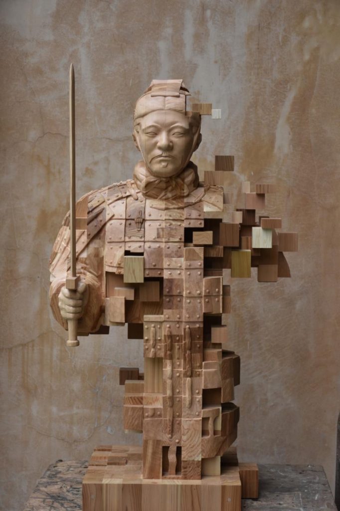
John Jay Cabuay is a New York City illustrator. His work has been seen in many aspects of promotion and art such as newspapers, magazines, and book covers. He has a MFA (Master of Fine Arts) degree which came from the Fashion Institute of Technology. He is also known for the artwork of the widely known book, “”Get Up, Stand Up” which is based on the song by Bob Marley. His graphic design is very illuminating and bold, creating a very beautiful masterpiece of saturation and texture. I found his book cover art amazing because with the book covers, he creates a very appealing image that people can almost tell a story behind. That’s the perfect area of art for a book cover with it being a story inside. He also flourishes in portraits and line art, layering vivid colors alongside bright and bold colors. He uses computer art, mainly photoshop in order to create a more professional and solid look for the pieces. With him being known to participate in many aspects of art, it shows how elusive he is with his talent and how he doesn’t limit himself from just one area in the art field. The reason why I chose John Jay is because him and I have a lot of resemblances when it comes to interest in the artist industry. I want to be able to do art in many different ways, from creating logos, to book covers and even museum paintings. I don’t want to be considered a “book cover artist” or a gesture drawing guru; I want to be known as the artist that goes above and beyond for each task he takes on. I’ve always doodled my own book cover images and wanted to create images that can be viewed by the public on a daily bases and what better way can someone’s art be viewed than being seen in a daily newspaper or top charting books. John Jay’s work is a simple art of beauty.

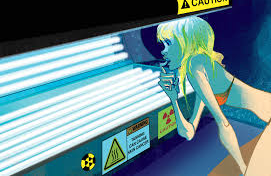
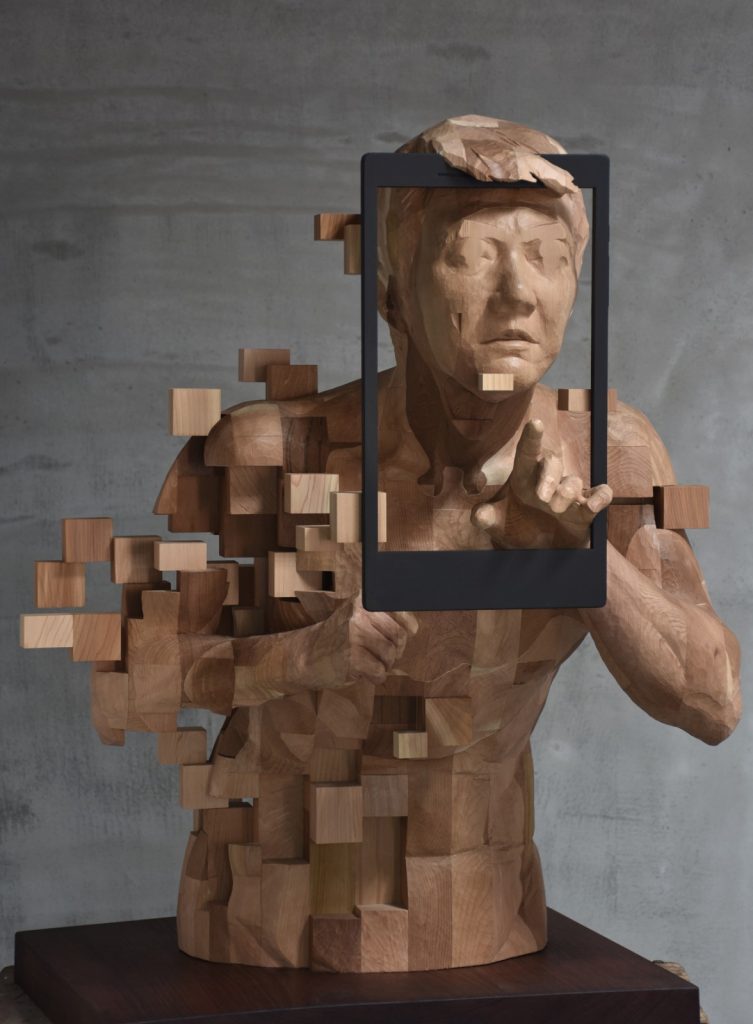
This picture is an example of Cabuay telling a story within his artwork without going deep into detail. When the viewer sees this picture, they begin to do the same thing the lady in the picture Is seen doing. In the piece, she is seen making a wondering gesture as to what the tanning machine may present to her. Once the viewer sees this, the proper support would be the several dangers of the tanning machine listed alongside the artwork. His artwork tells a story within a story. It creates the perfect coincide.

http://www.johnjayart.com

Carrie Mae Weems- Makayla Stovall

Carrie Mae Weems 

Carrie Mae Weems is a contemporary artist from Portland, Oregon. She was born in 1953. She trained in dance with the postmodern dancer Anna Halprin. She studied at the California Institute of the Arts, Valencia, in 1981, where she earned her Bachelor of Fine Arts. She earned her Master of Fine arts at the University of California, San Diego in 1984. She then continued her studies in the Graduate program in Folklore at the University of California, Berkeley. Weems’ is best known for her photography creates art while working with text, video and audio installation, and digital images. Her first camera was given to her as a present from her boyfriend on her 20th birthday. When she first picked up the camera, she thought to herself, “Oh okay, this is my tool. This is It.” She has always had a powerful desire to create images. 

Weems moved to Syracuse, New York in 1996 to be with her husband, Jeffrey Hoone, though majority of her family remains on the west coast. Weems’ mother, also named Carrie, her daughter faith, and many of her aunts and uncles appear in her early work. 

Through her work, she investigates relationships, family, sexism, political systems, class, and the consequences of power, along with her views on global struggles for equality and justice. African Americans are primarily her main subject, but a concept of universality is present. Weems has stated that she wants “people of color to stand for the human multitudes” and for her art to resonate with audiences of all races. Over the years, she has engaged and participated in various solo and group exhibitions at notable national and international museums including the Metropolitan Museum of Art, The Frist Center for Visual Art, Solomon Guggenheim Museum in New York, as well as the Centro Andaluz de Arte Contemporaneo in Seville, Spain.  

Carrie Mae Weems has been presented with an abundance of grants, awards and fellowships. The Prix de Roma, The Anonymous was a Woman, The National Endowment of the Arts, The Tiffany Awards, and the Alpert have all been awarded to her. She was one of the first people to be given the US Department of State’s Medals of Arts in acknowledgement for her dedication to the State Department’s Art in Embassies program. She also was presented the MacArthur “Genius” grant, the Congressional Black Caucus Foundation’s Lifetime Achievement Award in 2013, the Lucie Award for Fine Art, and the BET Honors Visual Artist Award. She was one of the four artists recognized at the Guggenhiem’s 2014 International Gala, and an recipient of the ICP Spotlights Award from the International Center of Photography. 

The Kitchen Table Series: 

This is one of her most well know photography projects. It is a story of a “self- possessed woman with a bodacious manner, varied talents, hard laughter, and multiple opinions.”This is the series that formed her career and inspired a new generation of Artists. The New York Time Style Magazine describes this body of work to represent the first time an African American Women could recognized her own self and experience in her art.  

http://carriemaeweems.net/galleries/kitchen-table.html

Frist Center for Visual Art: 

https://fristartmuseum.org/calendar/detail/carrie-mae-weems-three-decades-of-photography-and-video

From the photography project  “Colored People” 1989-1990 
Image from the Louisiana Project
From the Photography Project “The Louisiana Project” 2003
Image of a globe from And 22 Million Very Tired and Very Angry People
From the Photography Project “And 22 million Very Tired and Very Angry People” 1989-1990
Image from the Mayflowers Long Forgotten
From the Photography Project “Mayflowers Long Forgotten” 2003
Image from Operation: Activate
From the Photography Project Carrie Mae Weems & Social Studies 101, Operation: Activate” 2011
Image from the African Jewels series
From the Photography Project “African Jewels” 2009
Image from the Dreaming in Cuba series
From the Photography Project “Dreaming in Cuba” 2001

Fun Facts: nytimes.com/2018/10/15/t-magazine/carrie-mae-weems-intervie(opens in a new tab)

Woks Cited: 

https://art21.org/artist/carrie-mae-weems/

http://carriemaeweems.net/bio.html

http://www.artnet.com/artists/carrie-mae-weems/

Frans Hals – JR Norris

Frans Hals, Sometimes called Frans Hals the Elder, was a Painter from the Dutch Golden Age. He was born sometime in 1582 or 1583 in Antwerp, Netherlands, and lived until August 26, 1666. During this time he became popular for his artwork, largely in Portraiture.
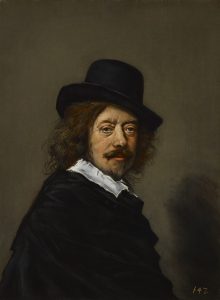
Copy of self Portrait After Frans Hals [Public domain]

Something that distinguishes Frans Hals from other painters of his day was that he was fond of, and is now considered a master of a style that, in his day was considered poor skill or flawed. He deliberately and left his brushstrokes to create depth and texture in his pieces, lending, in his opinion, more realism to the subject as seen here in Gypsy Girl in contrast to his earlier Cavalier Soldier, sometimes called the Laughing Cavalier. In the late 1600’s a biographer, Schrevelius mused: “An unusual manner of painting, all his own, surpassing almost everyone.” (en.Wikipedia.org/Franshals)

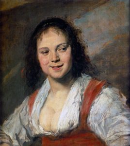
Gypsy Girl Frans Hals, 1628-30 [Public domain]
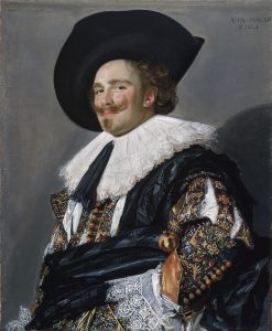
Cavalier Soldier Frans Hals 1624 [Public Domain]

His artistic career began in 1610 as he joined the Haarlem Guild of Saint Luke, where he labored as an art restorer for the City Council, restoring mostly Religious pieces that had been in dispute between Catholics and protestants. The collection he had been restoring was sold and removed from the city and he was forced to find a new genre to work in. Portraiture was the answer.

Largely he painted the different levels of society in their respective levels of dress. Though most of his customers were Protestant and reserved in their attire, he was also commissioned very frequently to do wedding portraits, and frequently painted the wealthy at parties. It is thought that the dress of his clients contributed to the departure from vivid colors to largely black dominated pieces.

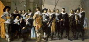
Frans_Hals, De Magere Compagnie, 1637 [Public Domain]

Though his early works are said to study his contemporary, Rembrandt, he developed his own style and even a trademark pose of looking over the back of a chair. His progression over time is easily seen through these similar compositions.

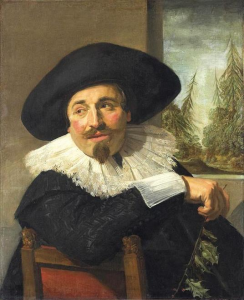
Portrait of Isaac Abrahamsz M assa. 1626 [Public Domain]

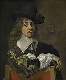
Portrait of Willem Coymans, Frans Hals 1645 [Public Domain]

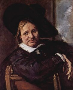
Portrait of Isaac Massa. 1665 [Public Domain]

The first and last are actually the same man years apart, but you can see the drastic change in mood between the two by the difference in color.

His work fell out of favor after his death for a while but returned to prominence later.  Much later in the late 1800’s, it is recorded that Vincent van Gogh wrote to his brother: “What a joy it is to see a Frans Hals, how different it is from the paintings – so many of them – where everything is carefully smoothed out in the same manner.”   (en.Wikipedia.org/Franshals)

Over 200 years after his death, Frans Hals has been identified as major influencer of what are considered his “posthumous” students. These include greats such as Claude Monet, Edouard Manet, Charles-François Daubigny, Max Liebermann, James Abbot McNeill Whistler and Gustave Courbet among others.

JR Norris

Jamian Juliano-Villani- Keante Clemons

Though much is not given on the early life of Jamian Juliano-Villani, it is however known that she was born in the year 1987 in Newark, New Jersey to two commercial painters. Even as a child Juliano-Villani found herself wanting to delve into the world of art, as her parents had owned a silk-screening company where she took a liking to 1970s and 80s graphic design. Eventually, Juliano-Villani went on to attend and graduate from Rutgers University in 2013.

Juliano-Villani’s inspiration is completely driven by her emotion and sense of intuition. Consequently, her process for creating art yields long and demanding work hours in her studio. She also finds her inspiration in the environment around her. When she feels that the studio and the internet does not yield enough of the inspiration she needs, she will venture out into the streets of Manhattan observing both her surroundings and the objects within it. She has also over the years developed a liking to using material from books, as she feels that this material is more personal and intimate. She been quoted as saying, “It can’t just be the most obvious reference; it should from somewhere specific. And it really only happens in books. On the Internet everything’s everywhere. It feels like it’s more mine, if I get it from a book.”

https://art21.org/watch/new-york-close-up/jamian-juliano-villanis-field-work/

As far as Juliano-Villani’s work is concerned, she uses paints (acrylic and oil) and also tends to utilize tools already available to her by projecting images of characters from cartoons and literature. For example, according to Art21.org, “Juliano-Villani begins her process with visual references from books, magazines, and other print media she has collected since high school.” (Art21) In addition, her work tends to be rough in nature and her color choices, bold, which is a reference to one of her favorite art veterans Peter Saul.

Jamian Juliano-Villani photographed by Aubrey Mayer

Juliano-Villani’s first solo exhibition was one entitled “Me, Myself, and Jah” which opened on September 14, 2013 in the Rawson Projects of New York. The exhibition consisted of many interesting pieces that clearly depict her style of work and also a glimpse into the rigorous production of the pieces.

Roommate Trouble 2013 Jamian Juliano-Villani

Aside from the clearly appealing nature of her work, Juliano-Villani also envokes a sense of irony in her pieces. For instance, although each piece that Juliano-Villani creates consists of bright and/or vibrant colors, and usually have abstracted (distorted) figures standing in place for more practical ones, the intended meanings behind her pieces are more politically based and shed light on common worldly issues. Such can be seen in her works “Substance Free”, “Boxer’s Embrace”, and “The Entertainer”.

Jamian Juliano-Villani, Substance Free, 2015
“Substance Free” 2015 Jamian Juliano-Villani
Artwork by Jamian Juliano-Villani, Boxer's Embrace, Made of acrylic on canvas
Boxer’s Embrace 2013 Jamian Juliano-Villani
The Entertainer 2015 Jamian Juliano-Villani

Bibliography

“Jamian Juliano-Villani.” Art21, https://art21.org/artist/jamian-juliano-villani/.

Nick Cave – Darrion Mason

Nick Cave was born in Fulton, Missouri on February 4, 1959. He is known for his performance art in sculpture, specifically his sound suits. His Love for sound suits began as a response to the Rodney King beating. The sound suit that is worn is considered the second layer or skin on the body. This represented race, class, and gender allowing those who viewed Cave art work to view it without being influenced by the identity of the model in the suit. One thing about Cave that allows him to stand out among other artist is that he often executes his pubic appearances.

One of Nick Cave’s projects was Here Hear began in Detroit because he found it critical for him to expand his art career there. This project consist of 7 months of events throughout the city of Detroit. When this project was launched it was Caves largest series of events.

Image result for here hear nick cave"

Knowing what lied ahead of him, his mother told him that being a black male in America could work against him, he knew he’d have to develop tough skin.

Image result for nick cave thick skin"

Sojourn is located in the Denver Art museum. It features almost forty art works including twenty-four sound suits. Cave’s sound suits in this exhibit allows viewers to have a surreal experience. Are made out of buttons, found objects and short films.

Image result for sojourn nick cave artist"

Elle Pérez – Hayden Brown

ELLE PÉREZ IN THEIR NEW YORK STUDIO, 2018.

Elle Pérez was born in 1989 in the Bronx area of New York and is a gender-nonconforming trans artist who primarily uses photography to explore ideas of intimacy, vulnerability, and gender identity. Perez varies slightly with the materials they use, but they mainly use either Digital Silver Gelatin prints or Archival Pigment prints for their work; both measured as 44 3/8 x 31 x 2 inches. They received a Bachelor of Fine Arts in Photography in 2011 from the Maryland Institute College of Art. From there they went on to attend the Skowhegan School of Painting and Sculpture and received a Master of Fine Arts in Photography from Yale School of Art in 2015.

Elle Pérez, Untitled, Bronx 2015.

Pérez first became interested in photography at the age of 12 when they started photographing the Bronx punk community; and by doing so ended up documenting many of the individuals who defined these spaces. An example of their earlier work can be seen above; this particular series was taken around 2016 and focused on documenting the New York entertainment wrestling scene. As of today, Pérez’s work has been included in around 26 exhibitions within the last 8 years. However, their work began gaining more attention in 2018 due to their first two solo exhibitions; “In Bloom”, which was displayed at 47 Canal in New York, New York, and “Diablo”, which was displayed at the MoMA PS1 in New York, New York. It is worth noting that “Diablo” is not necessarily a completely separated work from “In Bloom”, instead it is more of a continuation of it. This is why many of the same ideas of gender identity and intimacy from “In Bloom” carry over into “Diablo.”

Instillation shot of In Bloom, 2018.
Instillation shot of Diablo, 2018.

Although most of their work initially seems like street or documentary-style photography, nearly all of their art is actually highly staged. Pérez, as an artist, doesn’t seem to be necessarily interested in the actual moment or individual they are photographing, instead they are interested in documenting the feeling or relationship of their subject. Due to this they tend to focus more on specific parts or details of their subject. An example of this can be seen in Pérez’s photo titled “Binder” from their 2019 exhibition, “In Bloom”. The subject is quite plain, it’s simply a chest binder hanging on a curtain rod. However, Pérez focuses on the details of the binder, such as its frayed straps, discoloration, and the holes in the back of it. By doing so, Pérez highlights the relationship they have to the binder, like how many years they have used it and how much they depend on it. Larissa Pham, Pérez’s text collaborator for “In Bloom” comments on Pérez’s work, “These details weight the form; it is how ordinary objects become haloed and special.”

“Binder,” 2015.
“Water Body,” 2016.
“Ian,” 2017.
“T”, 2018.
Wyley,” 2017.

Pérez is currently a Visiting Assistant Professor of Art, Film, and Visual Studies at Harvard University, a critic at the Yale School of Art, and a Dean at the Skowhegan School of Painting and Sculpture. Their most recent project was a solo exhibition titled “from sun to sun”, which was commissioned by the Public Art Fund, in partnership with JCDecaux. The project consisted of 16 new works displayed on bus shelters across all 6 borrows of New York. It was displayed between August 13, 2019 and November 24, 2019.

Citations

https://www.publicartfund.org/exhibitions/view/elle-perez-fromsuntosun/

https://www.newyorker.com/culture/photo-booth/elle-perezs-poetic-visceral-bodies

https://afvs.fas.harvard.edu/people/elle-perez

http://cargocollective.com/elleperez/CV

https://art21.org/watch/new-york-close-up/elle-perez-works-between-the-frame/

https://collectordaily.com/elle-perez-in-bloom-47-canal/

https://www.publicartfund.org/

Susan Hefuna – Manal Alzahrani

Hefuna is a woman and an artist of dual nationality. Being both German and Egyptian, she has felt at times deeply connected with both, and yet curiously attached to neither. Thus she has felt tossed by the tempest winds of a search for meaning. In using this, the calling has caused her to become nomadic, traveling frequently and seldom setting down roots for long. It has allowed her a unique perspective by which she has crafted, drawn, and built exhibits and visions of what she sees and feels. It has allowed her a unique perspective into the worlds in which she travels and what meaning that gives her. 

In Cairotraces, for example, her most recent exhibit in London and her third solo, she has explored the interwoven relationships that societies build and the links that have been caused to form amongst the dwellers and inhabitants of these places. It is an expression of her curiosity, an expression of a spell perhaps cast upon her by the cities and societies she is apart of and yet not apart of. At times it reflects her desire to move on and yet finding herself rooted for a timeless moment as if seeing something for the first time and unable to tear herself away. In this, she has defied convention and chosen to blaze a new path in the way that we see the creation of the world around us, and the societies we have built within our cities. 

It could be argued that had Hefuna not been born of this dual nationality and not been exposed to the sense of longing that she has, she might very well not have derived the powerful and expressive experiences that she has. She would simply one more amongst the variety of endless people she depicts in her artwork and craft. But she is apart from them, and she recognizes this for what it is. And that is reflected in her work, her calling, and her craft. Cairotraces is based upon earlier drawings that she had made and has now evolved into a fully three-dimensional piece of work. This reflects her ability to seek an evolution of her ideas and not simply accept them at face value. It reveals to us that she is continually growing and finding new meaning, and it is as if she is an archaeologist of ideas, and of thoughts and feelings that most are unable to recognize much less possess the ability to express in any cohesive form. 

That is perhaps the most poignantly powerful experience that a viewer can take away from the exhibit. It is the sense that even though we may feel that words cannot convey what we are feeling, we must nevertheless listen and allow it to speak from us, and we must endeavor to try and give it, it’s a voice. If we are able to do this, we will have found a new path to explore for ourselves, and we will have found a way to our own personal evolution in the experience of being a human being.

Josephine Halvorson – Lex Conley

Josephine Halvorson grew up in Cape Cod and is still based in Massachusetts. She is an oil painter based on real life observations based on real time perceptions. She first studied art on the beaches of Provincetown at the School of the Museum of Fine Arts, Boston. She attended The Cooper Union School of Art, Yale Norfolk, and continued her interdisciplinary education at Columbia University’s School of the Arts. Josephine Halvorson has taught at The Cooper Union, Princeton University, the University of Tennessee Knoxville and Columbia University

Both of Halvorson’s parents were artists as well. Her father taught art and made kinetic metal sculptures. Her mother studied painting and metal became her medium upon meeting her father. In her childhood, her mother inspired her and being the only child with no one to compare herself to- it became her mission to be as good as her mother. Josephine’s competitiveness with her mother eventually lead to her mother stopping art to allow her daughter to just be able to draw and not compare herself to her mother. Because Cape Cod isn’t far from New York City, she spent most of her childhood summers in art galleries and attributes this context of her childhood as a factor in her success.

Upon the completion of her interdisciplinary education at The Cooper Union School of Art, she spent a year in Austria, in which she described the experience to be a tremendous period of growth for her as an artist. She described her goal going into it as, “My proposal was to paint portraits in relation to both psychology and expressionism in painting. In other words, what’s the relationship of me, the artist, to a subject—whether it’s a person, an object, an environment, or whatever—and how can painting address this question in ways that other forms of art can’t.”

Halvorson often completes her paintings in a single session because she works on site. She finds objects in their environment that feels “look back” at her. Her process includes prolonged closeness and shared experience with her chosen subject matter and the human quality of their tools, their graffiti, their wear and tear. One could conclude that she practices art in its most basic form, which is highlighting the human experience and perception of the environment around us.

Halvorson’s work has been exhibited throughout the United States, Europe, and Mexico. Her solo New York exhibitions “What Looks Back” and “Clockwise From Window” at Monya Rowe were highly acclaimed.

Slow Burn is my favorite piece I came across. Upon discussing the selection, Halvorson described her process as, “My practice is one of understanding an object in time: its history, its function, its place in the world, its environment—and my own relationship to it,” the artist has said. The Southeastern Center for Contemporary art exclaimed that, “Halvorson’s twenty-three portraits of the inanimate world bear witness to a haptic encounter between herself, her subject, the material of paint, plus time.”

Image result for josephine halvorson

Han Hsu Tung – Rylee Campbell

Taiwanese artist Han Hsu Tung focuses on creating intricately designed wood sculptures. Tung has been an artist for three decades, in which he has created over three-hundred pieces. He was educated at the prestigious National Taiwan University as an anthropologist. Since 2015, Han has worked under the nom-de guerre Donald Harn. His works are inspired by personal feelings and the observation of social evolution and the influence of digital culture. In his early career, he focused on historical contexts, reality vs. imagination, left vs. right, and light vs. dark.

Beginning in the beginning of the twenty-first century, Han introduced his modern artwork that features the well-known pixilated and ever dispersing forms in his artwork. His work has encompassed the use of line and contrast through “pixilating” that has parallels with contemporary social evolution. He is a “master of marrying old and new” according to Jessica Stewart of My Modern Met. He began to show the transition from historical thought and design to a more contemporary technological aspect. His pieces care successful through the use of great technique and detail. He utilizes line, color, and contrast to make his pieces more impactful on the viewer.

Farewell, 2018

His unique style has made him widely popular by breaking the boundary of perfected wood carvings. His pieces are extremely well crafted yet interrupted by broken fragments of digitalization. For this reason, many of his works focus on a breaking was or disappearance of some sort. He does this to get people to understand the world we live in, and how over time, we are becoming more digitalized. With his works, he believes people are losing their sense of the past and are headed for a new fully digital and broken age.

Warrior of Imperial Qin, 2017

Han’s futuristic take encompasses the use of pixilating wood carvings. He puzzles together different colored wooden blocks, making some of them indented and others protruding. He plays the contrast of raw wood and finished sculpture. Many of his pieces imply the disappearance of history due to the modern digital age we live in.

Catcher, 2018

Many of Han’s works give off a sense of motion. For example, the piece “Catcher” shows the movement of the wood that seems as if you can see the ball hitting the glove.

Chess, 2018

His expertise in sculpture is evident in the piece, “Chess.”  The piece depicts a powerful horse standing for a knight on a chess board. The raw power of the horse is shown with intricate and smooth lines and curves, contrasted with the broken blocks of his digitalization.

Civil War, 2017

With his piece, “Civil War” he reengages his 1994 “War Series.” This work shows the passing of time and shows a hint of melancholy for the man and woman in uniform. The gap shows the distance between people as well as distance between thoughts of this generation and that of the time of the piece.

The image of the influence of technology is shown through his pieces, “iFashion” and “Where is the Like?” Both show a man connected with a device, which shows the great impact that technology and social media have on people of this time and how technology shapes the way we look and think.

Where is the Like?, 2019
iFashion, 2019

Ernesto Neto – Jill Van Domelen

Ernesto Neto

Related image

Ernesto Neto is a Brazilian Conceptual artist who lives and works in Rio de Janeiro, Brazil. His main focus is installations and sculpture. He began pursuing art in the 1960’s when he enrolled in art school. He realized sculpture was what he wanted to do after taking a clay workshop. His first solo exhibition was at the Petite Galerie in 1988 in Rio. Along with having his studio there, he also runs a gallery called A Gentil Carioca featuring new Brazilian artists. His work is now featured in many esteemed galleries including places such as New York, Paris, London, Tokyo, Los Angeles, and more.

Hayward Gallery

Neto’s work is largely about interaction. It is inspired by things like nature and the human body, specifically skin and the body’s relationship with water. In an interview Neto says, “There is always an edge between one thing and another – a membrane. My work is very much about this limit between one side and the other”. Some subjects that influence his work as well is his known interest in anthropology, cultural history, and physics. Neto’s works consist of fabrics, transparent, stretchy material, styrofoam pellets and spices to create his installations. The viewer is meant to feel, touch, and sometimes smell each piece he makes. He provides many ways to interact with his pieces, extending so far as to one piece that you can actually swim in. 

  Mother body emotional densities, for alive temple time baby son

One work called Mother body emotional densities, for alive temple time baby son displays his combination of fabric and spices. The fabric is polyester Lyrca and gives the impression of skin. The skin bags at\re filled with spices such as  turmeric, clove, cumin, ginger, pepper, and annatto. This work was featured in the Museum of Contemporary Art in San Diego.

Image result for Léviathan Thot
Léviathan Thot Europe at ‘le Panthéon’, Paris

Another work called Léviathan Thot featured in Europe at ‘le Panthéon’, Paris is a good example of the use of line and shape as well as unity and space. The materials used is lycra tulle, polyamide fabric, and styrofoam balls. The way the fabric is stretch and thin at the top and enlarged at the bottom by the placement of styrofoam. It is said to be a representation of the story in the Old Testament about the sea serpent, Leviathan in the book of Job. 

  • Unity- Consistency with the droplets and how it is all tied together in the center.
  • Line- The lines in this piece help it create a more representative feel. For example, the structures in this piece are often referred to as resembling raindrops, tears, webs. The lines again, spawn from the center. Your eye naturally moves from that center and all fabric from the top is thin and your eye is drawn to the bottom which again leads to the center. 
  • Space- The space in this helps create depth and interest. For example, if there were no holes in the center piece, all there would be is a white sheet and the eye wouldn’t be drawn as much. 
  • Shape- The shapes in this piece are important because if, for example, the styrofoam wasn’t round of the fabric wasn’t thin then it would give it a completely different feel and may not tell the same story. 
Picture